ULTA Beauty Kiosk
Timeline / 4 weeks
Overview
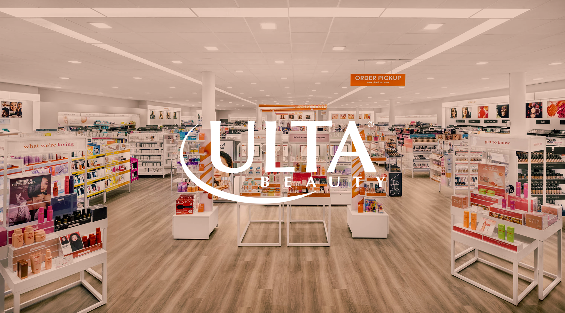
ULTA Beauty stores are a hub for creatives to express what they learn
Problem
Ulta stores are overwhelming with how many products are available, as well as lacking connection to their growing younger audience.
Interactive Design
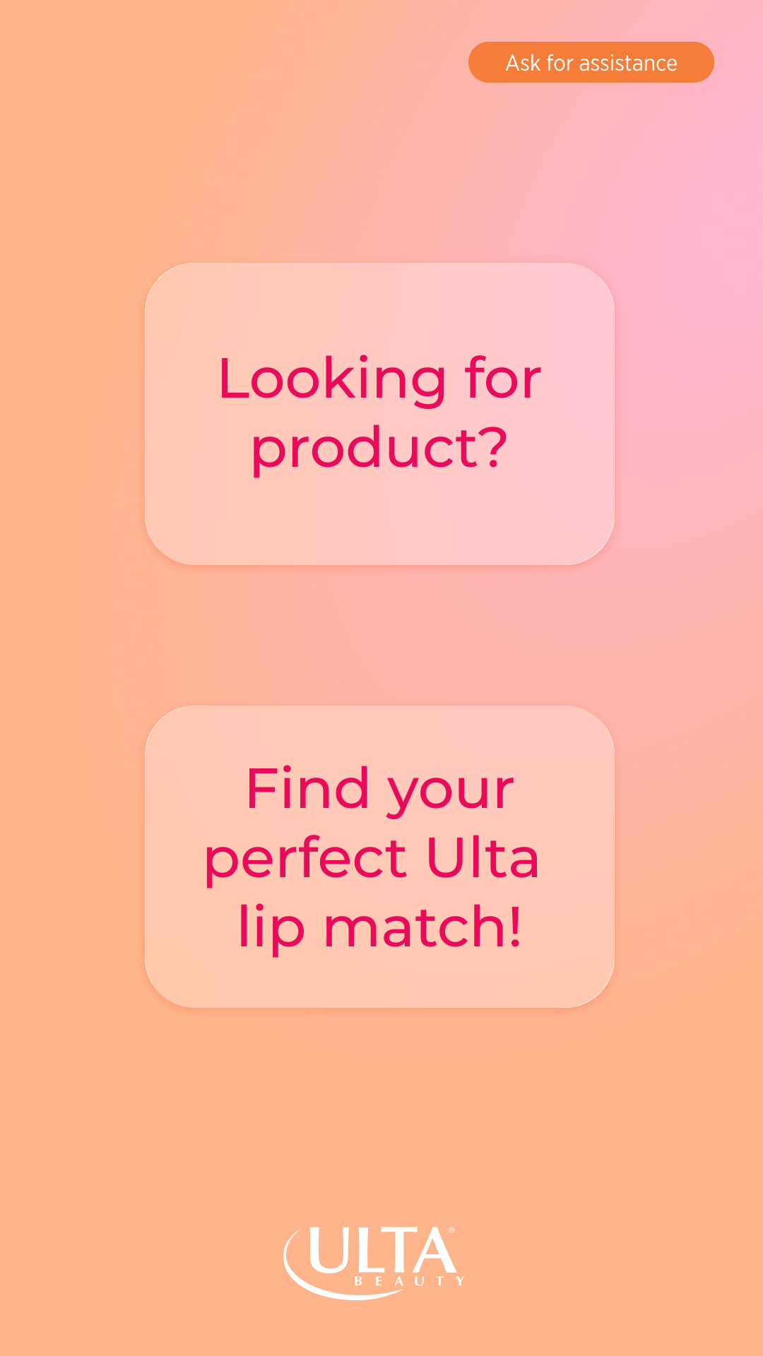
Visual Identity
Solution
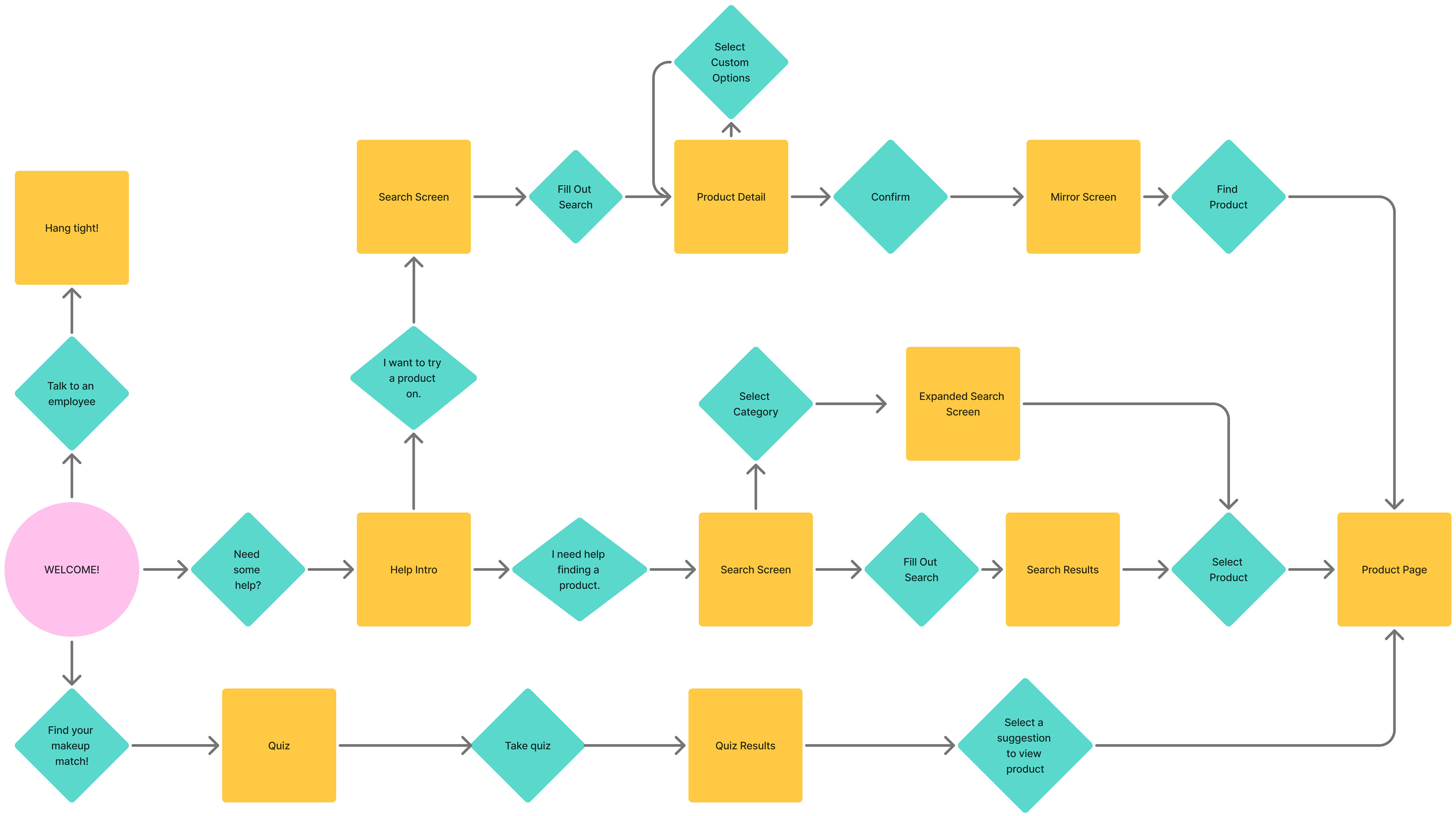
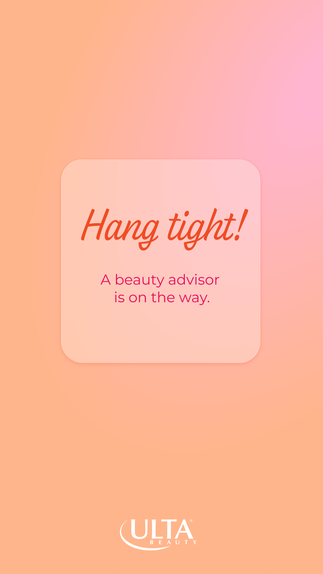
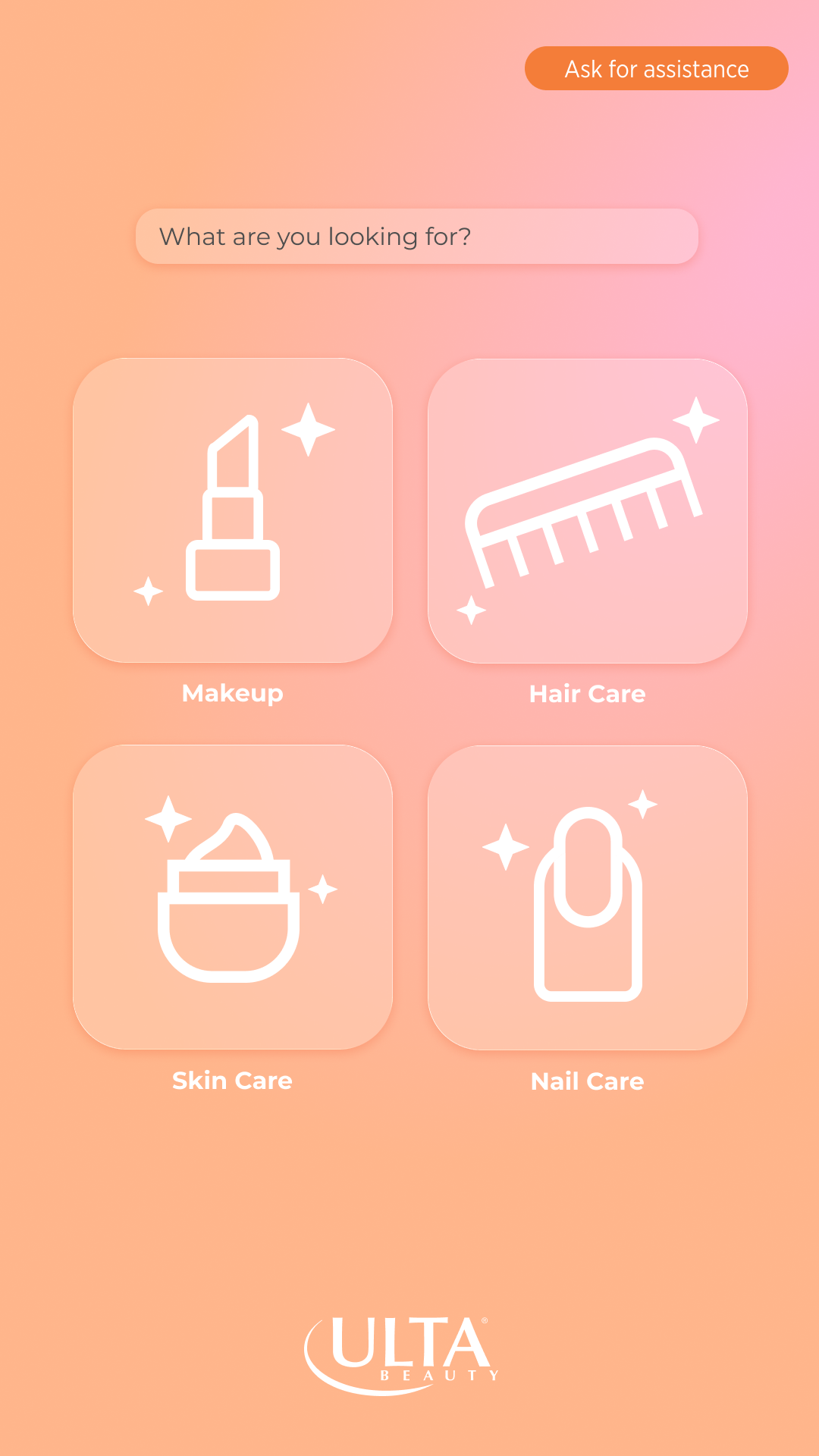
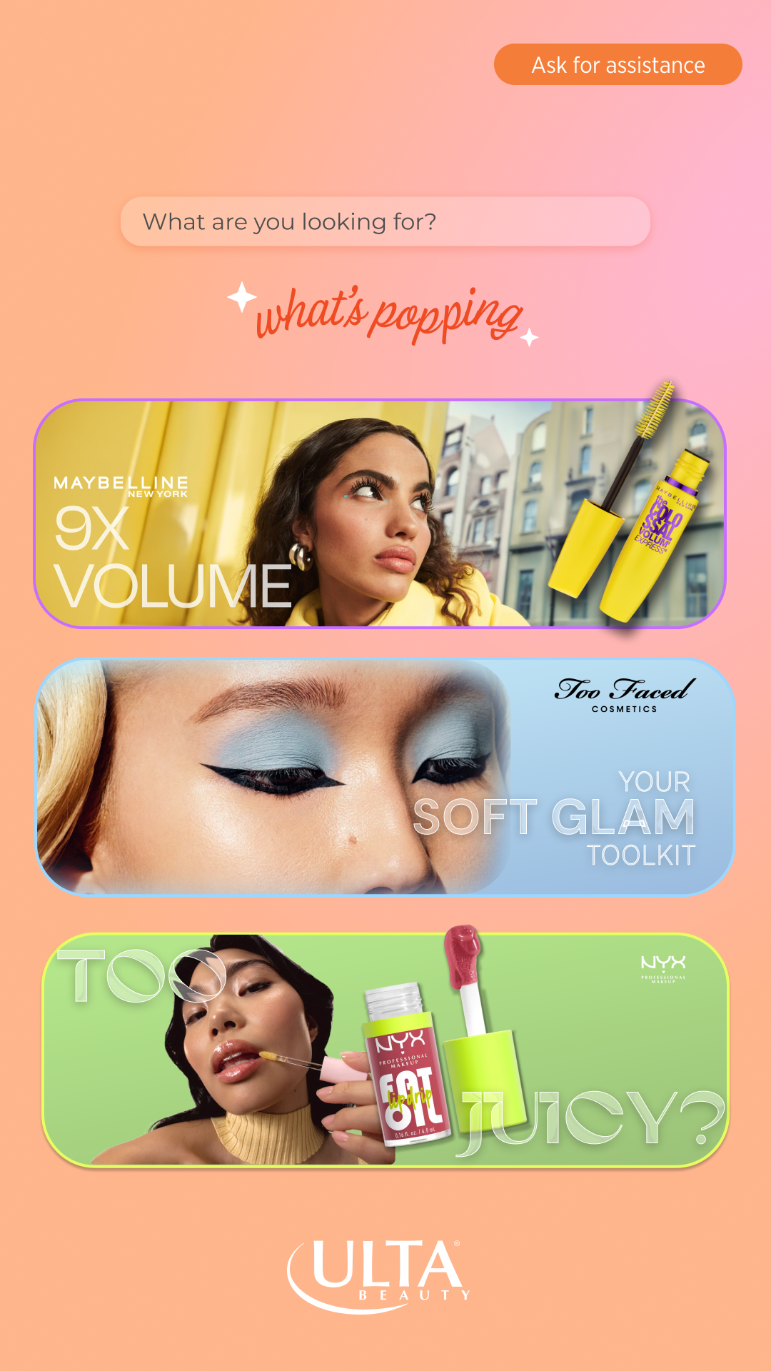
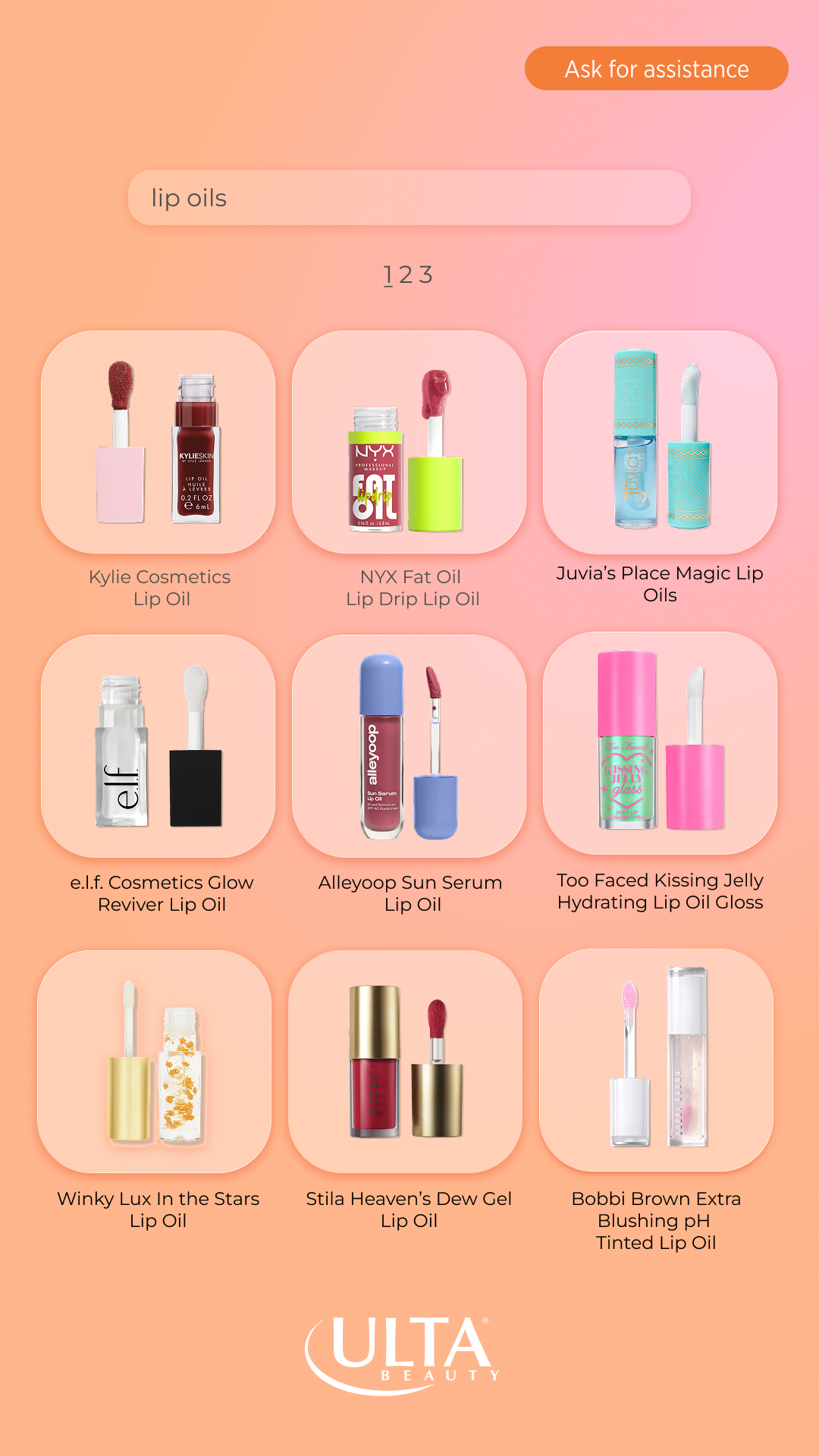
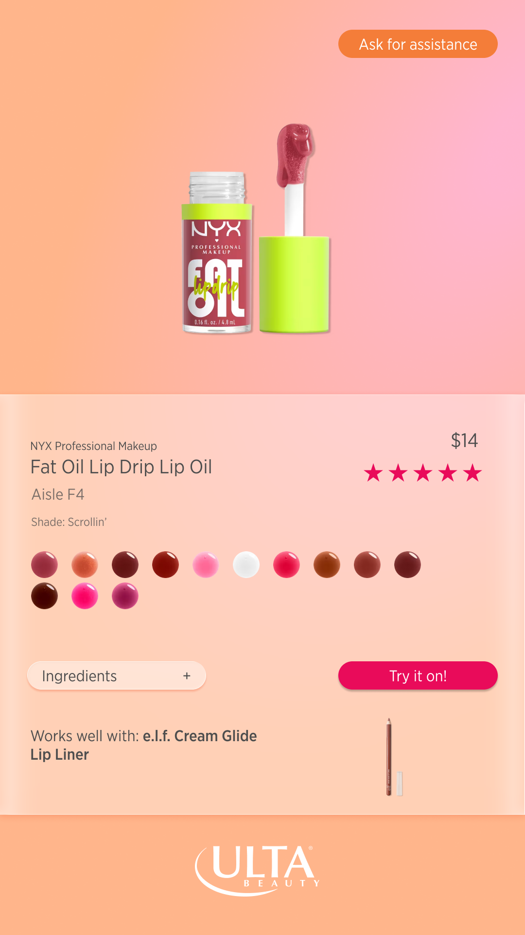
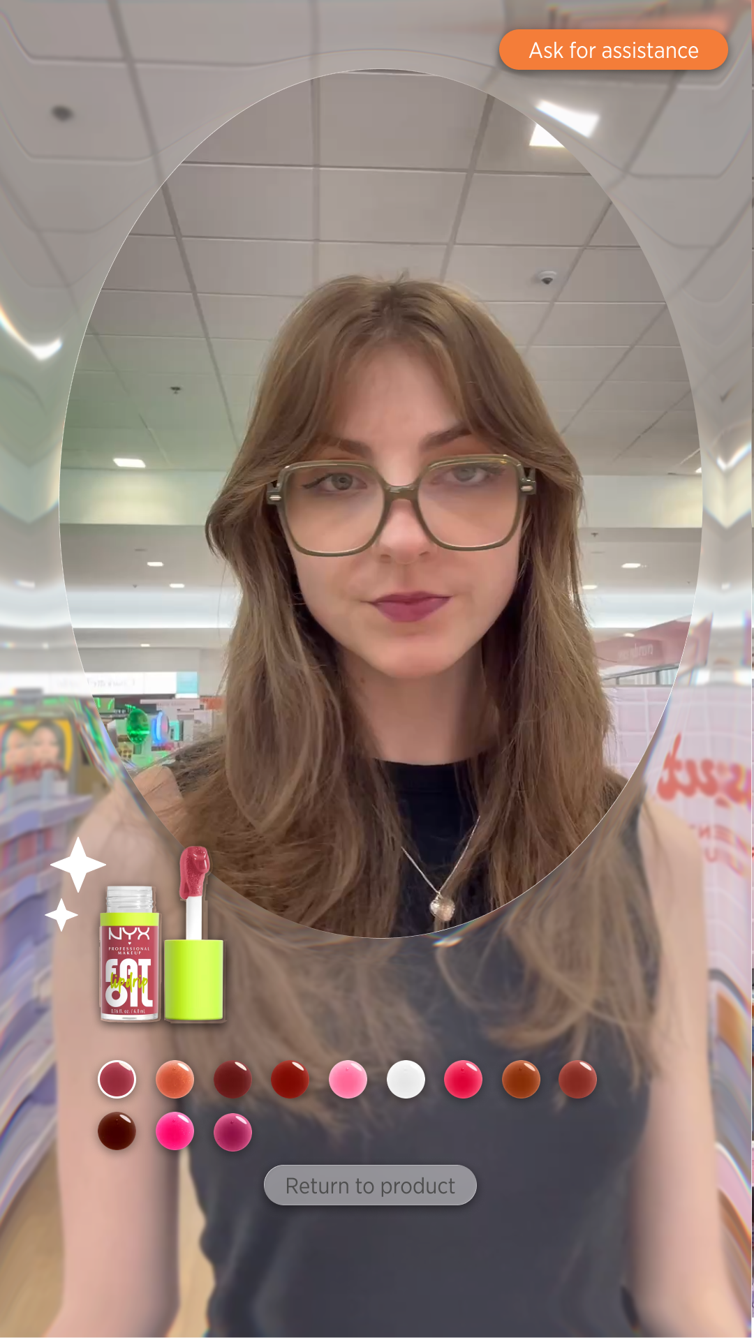
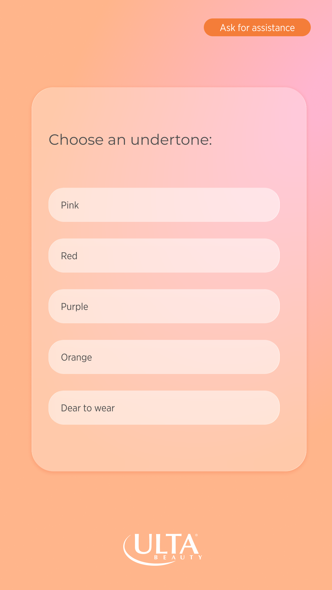
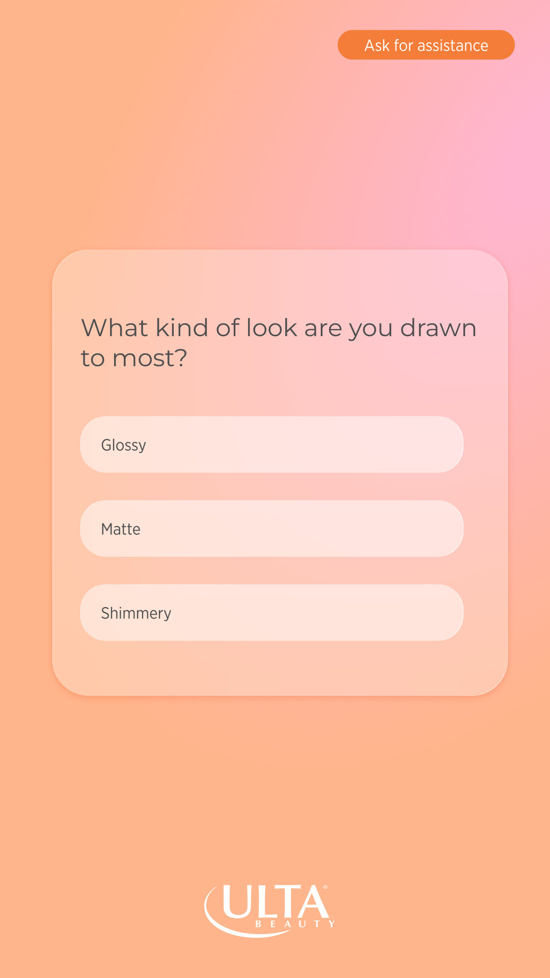
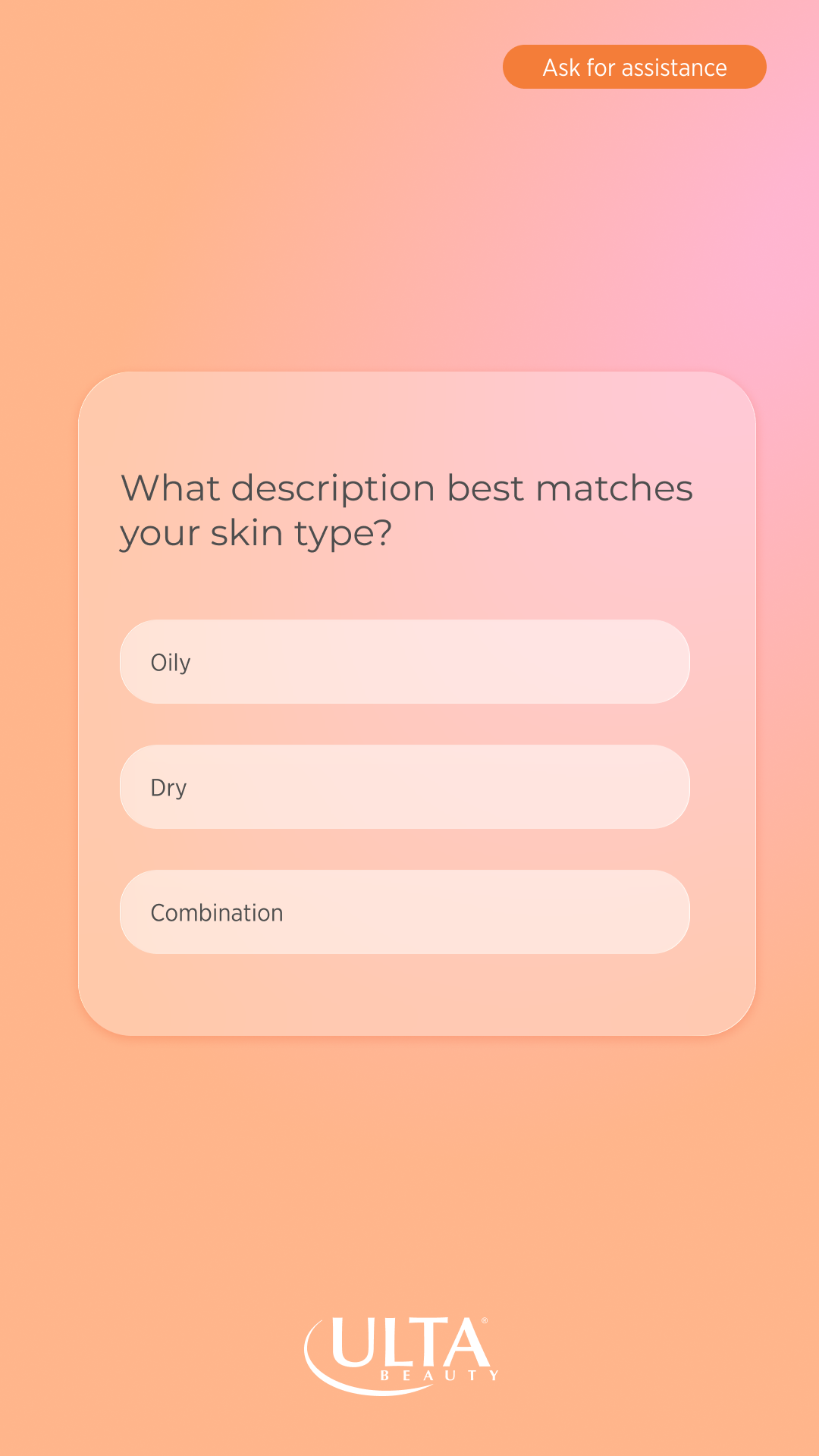
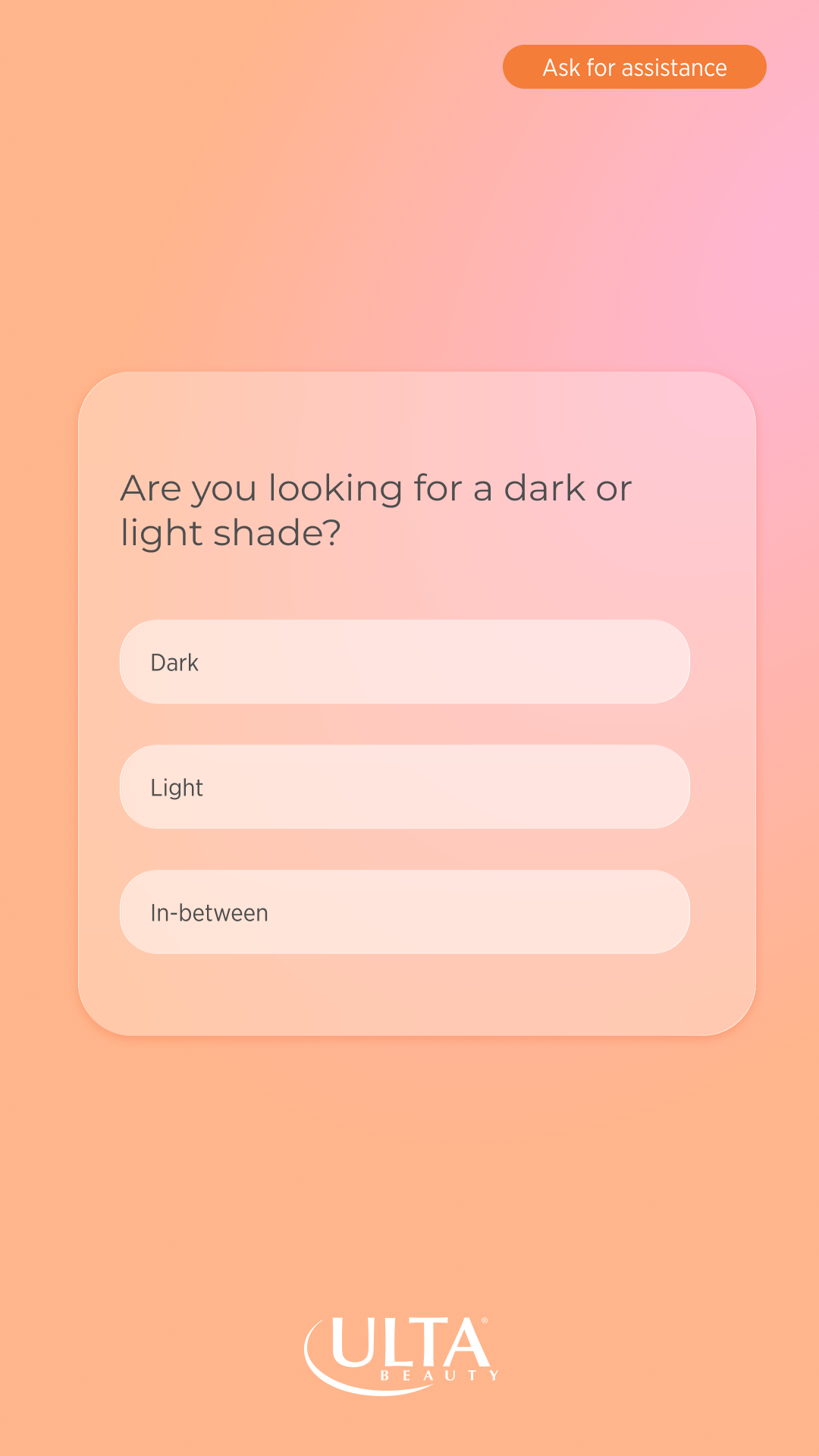
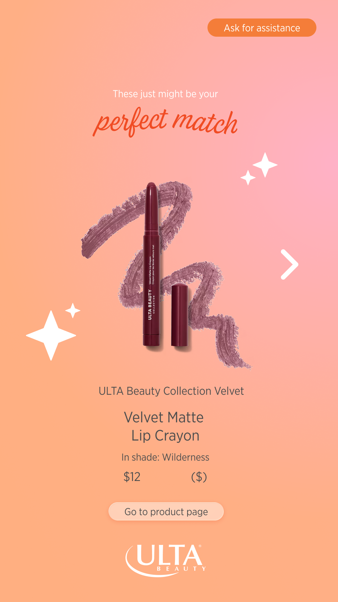
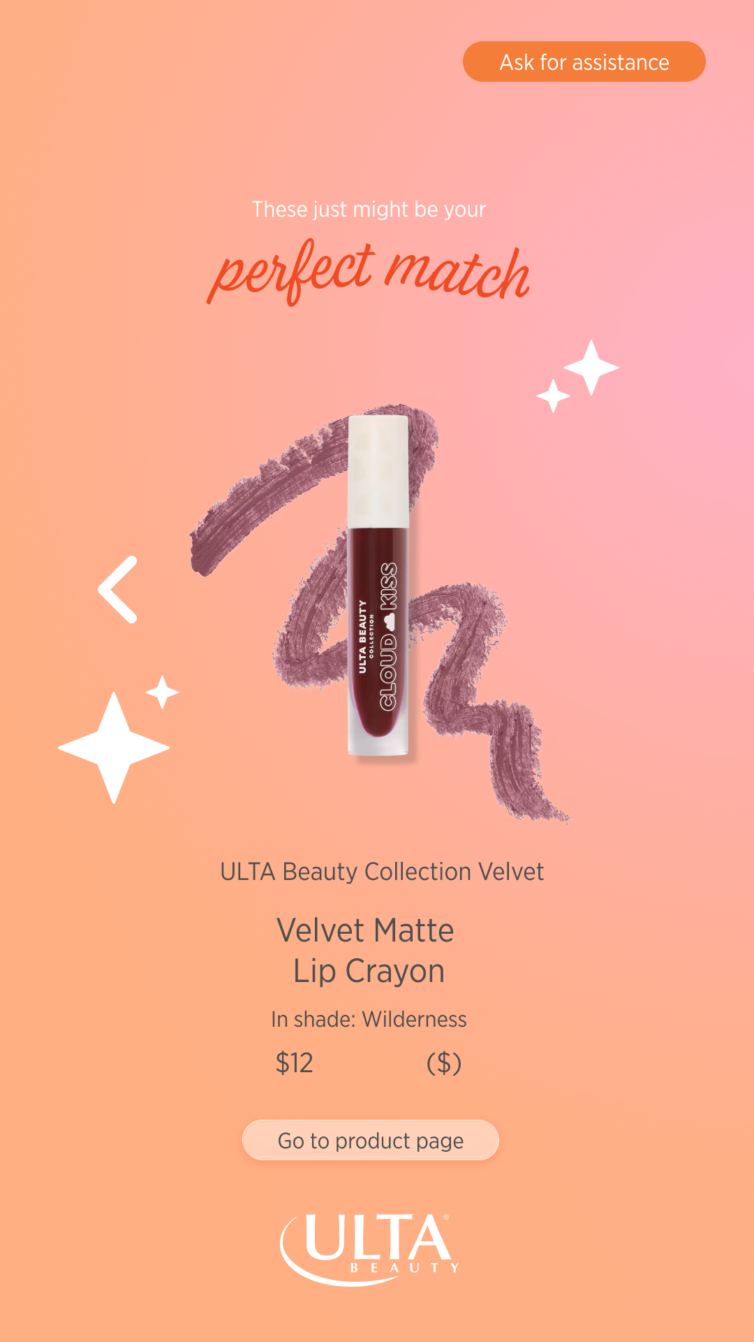
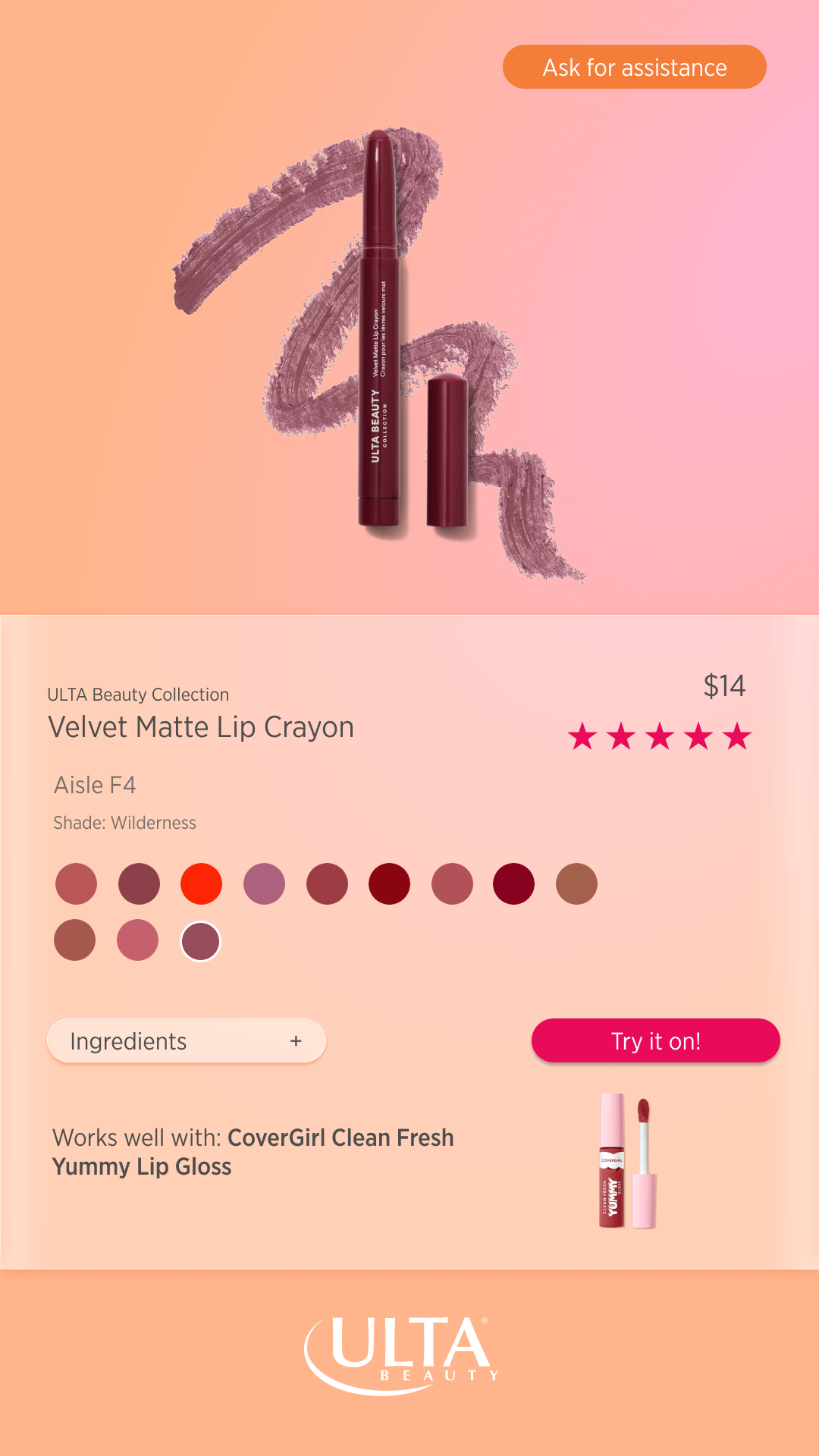
Kiosk that helps lead users to the product they are looking for while engaging user in a more fun experience including quiz and virtual try-on options.
User Flow
Wireframes
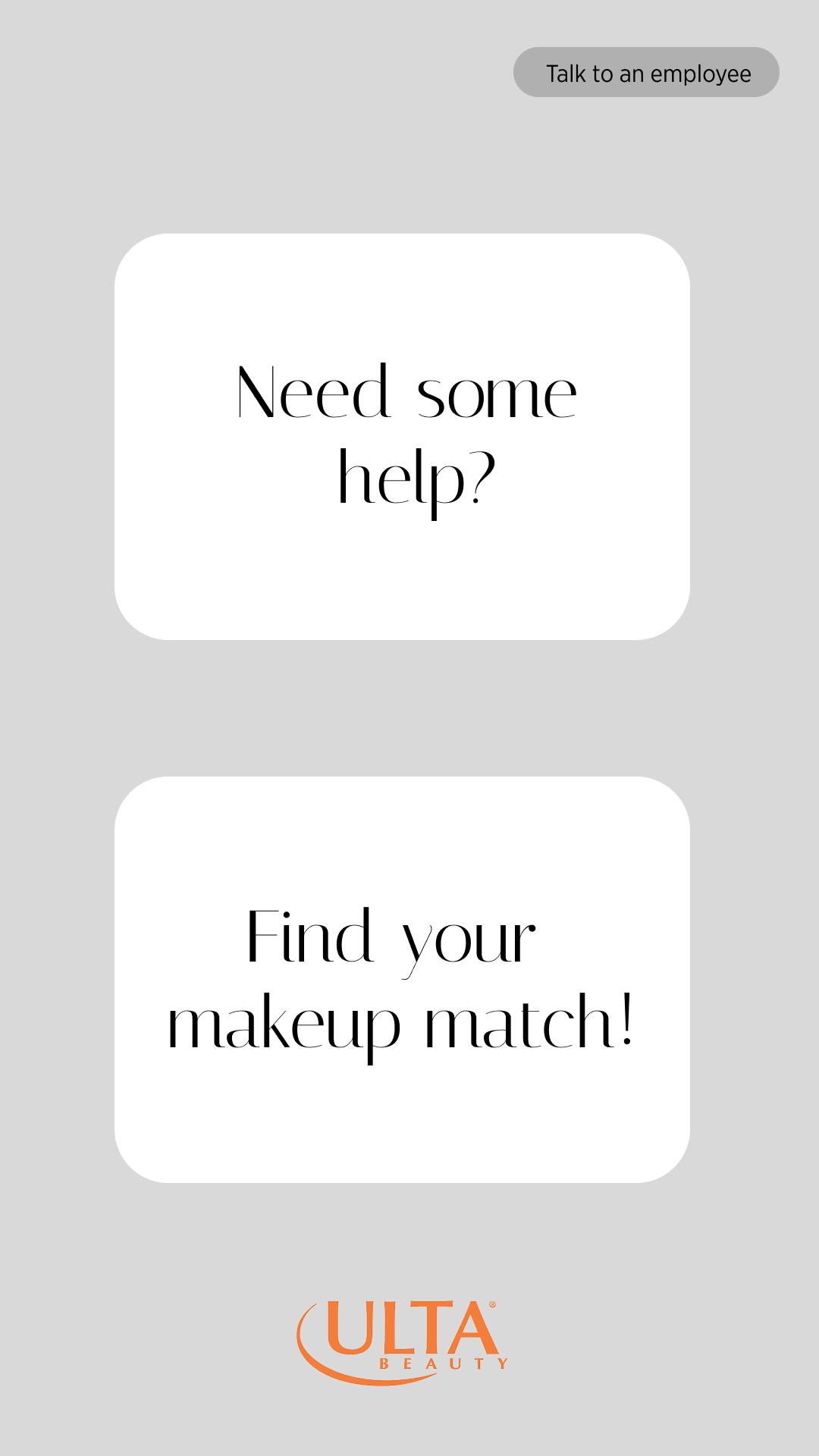
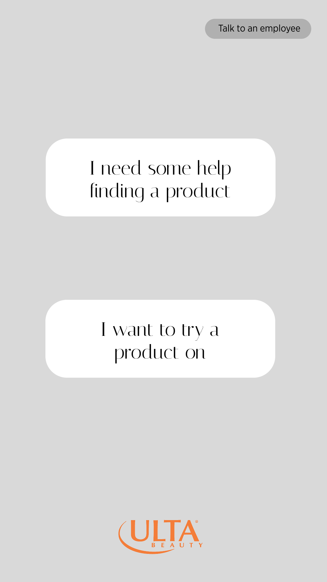
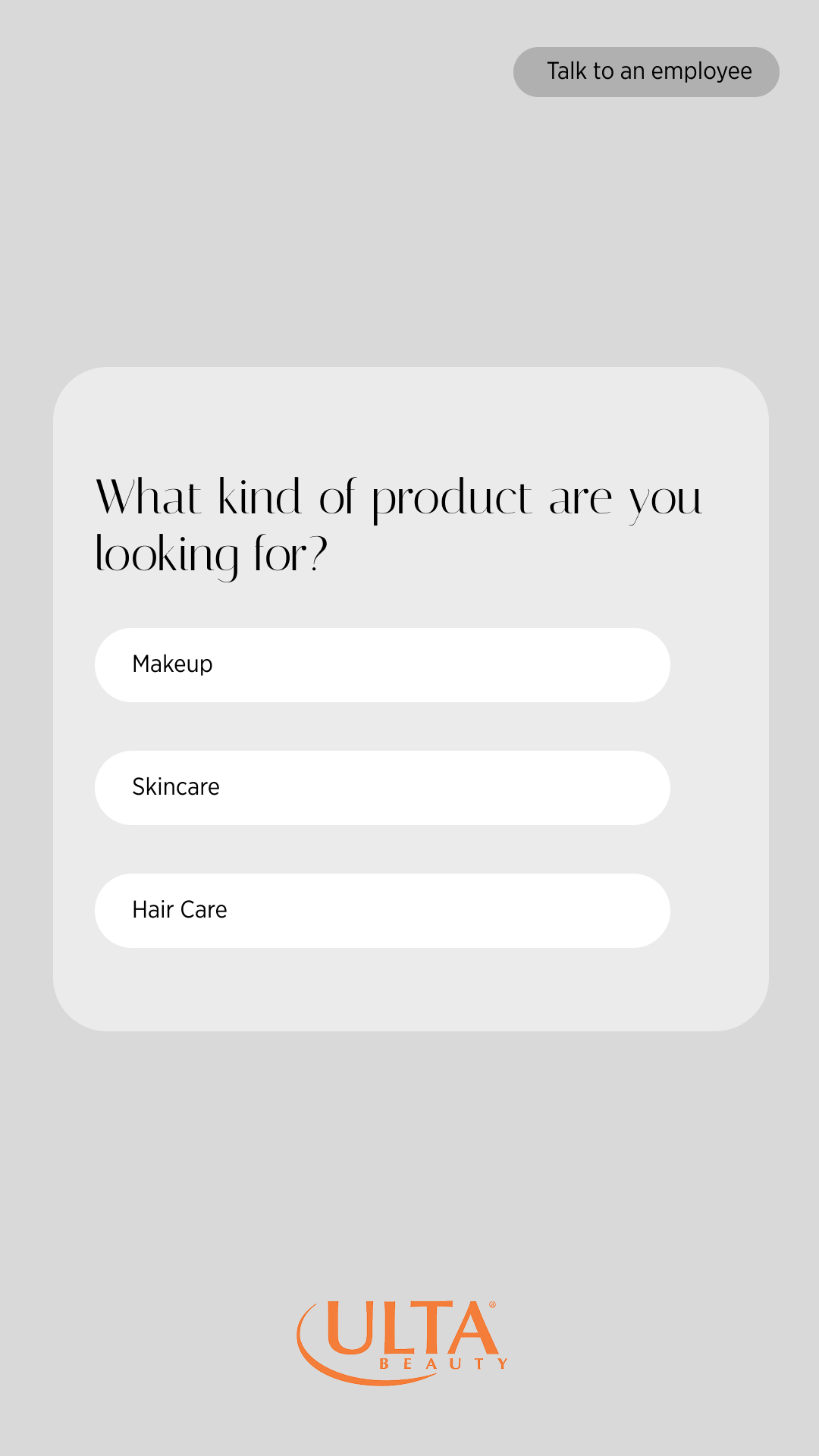
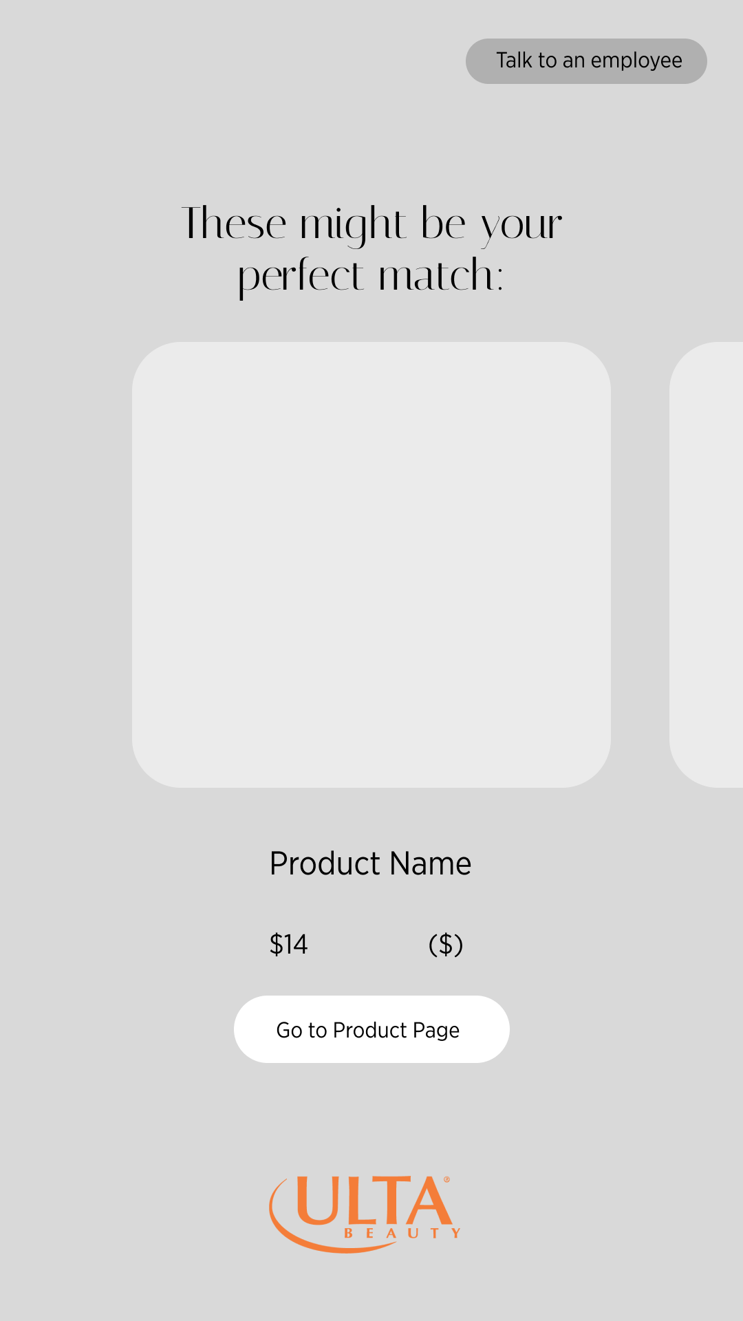
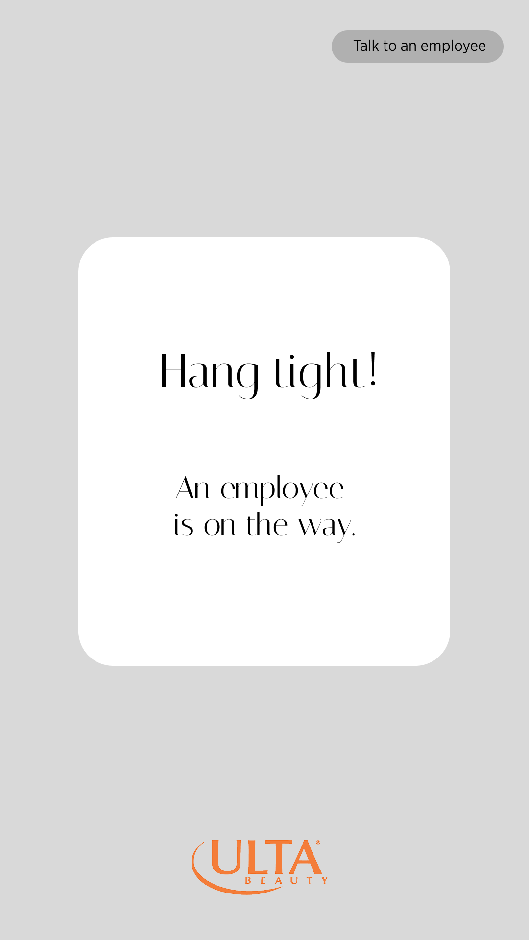
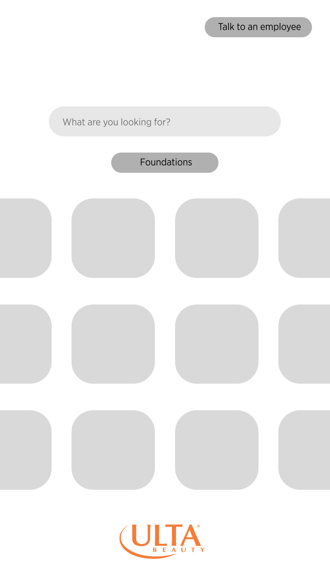
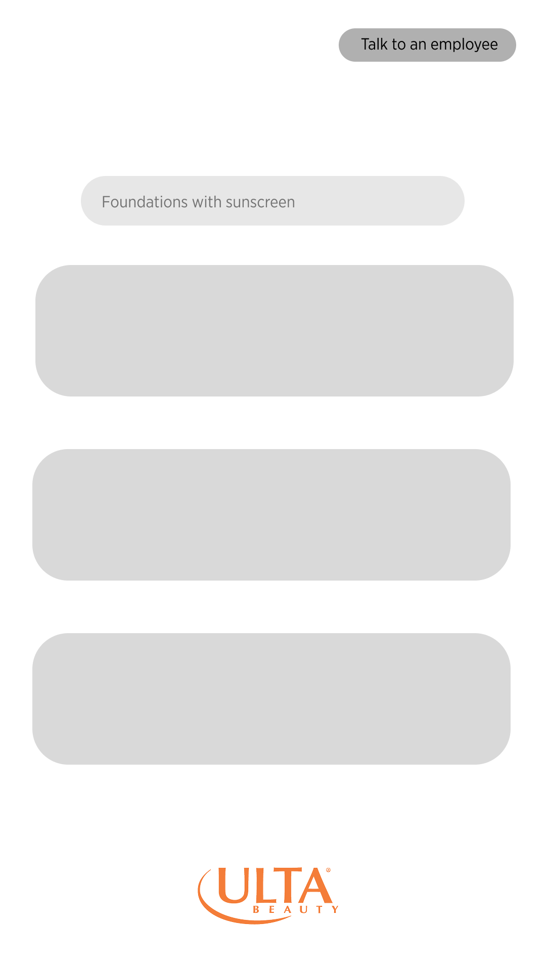
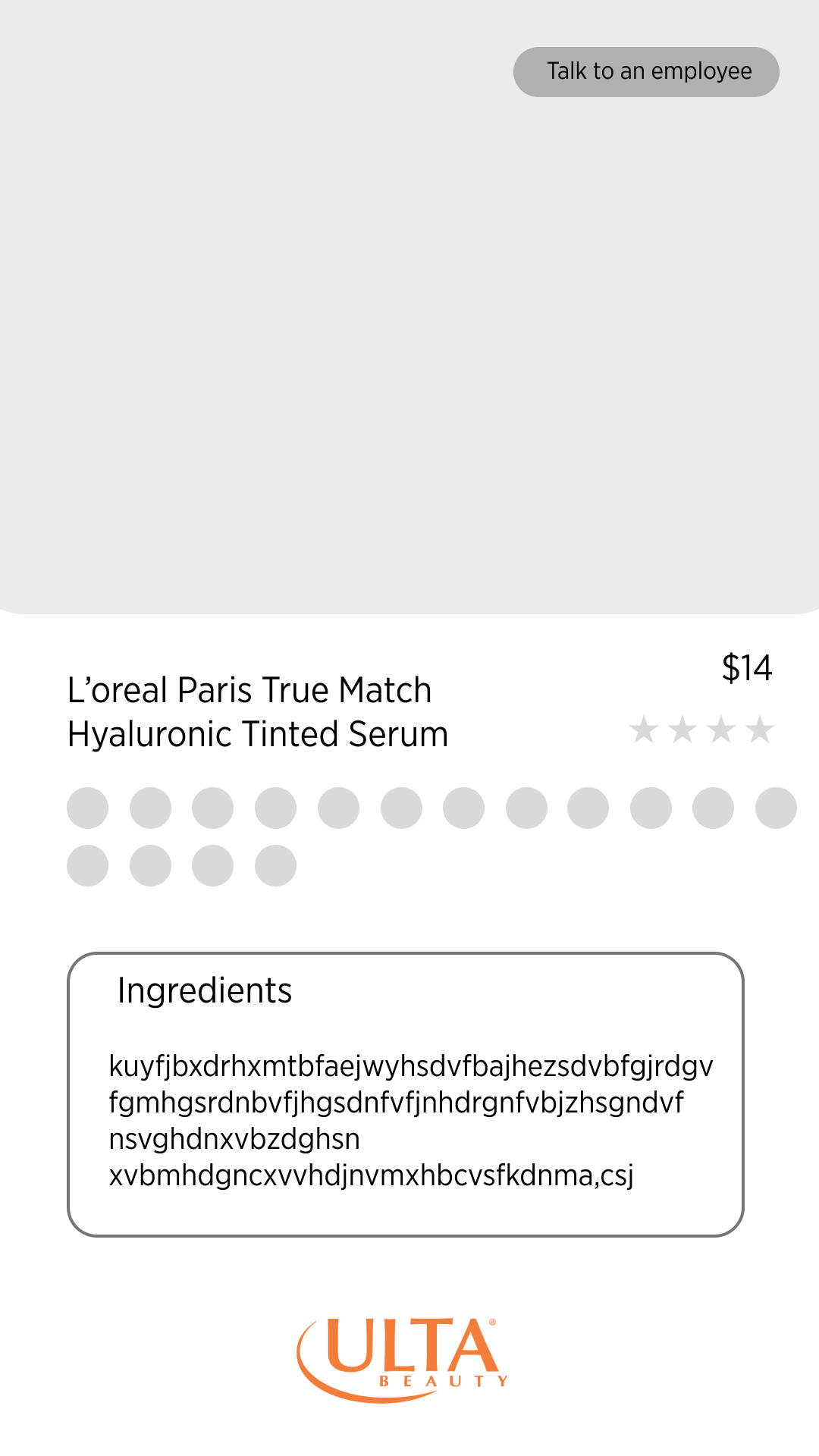
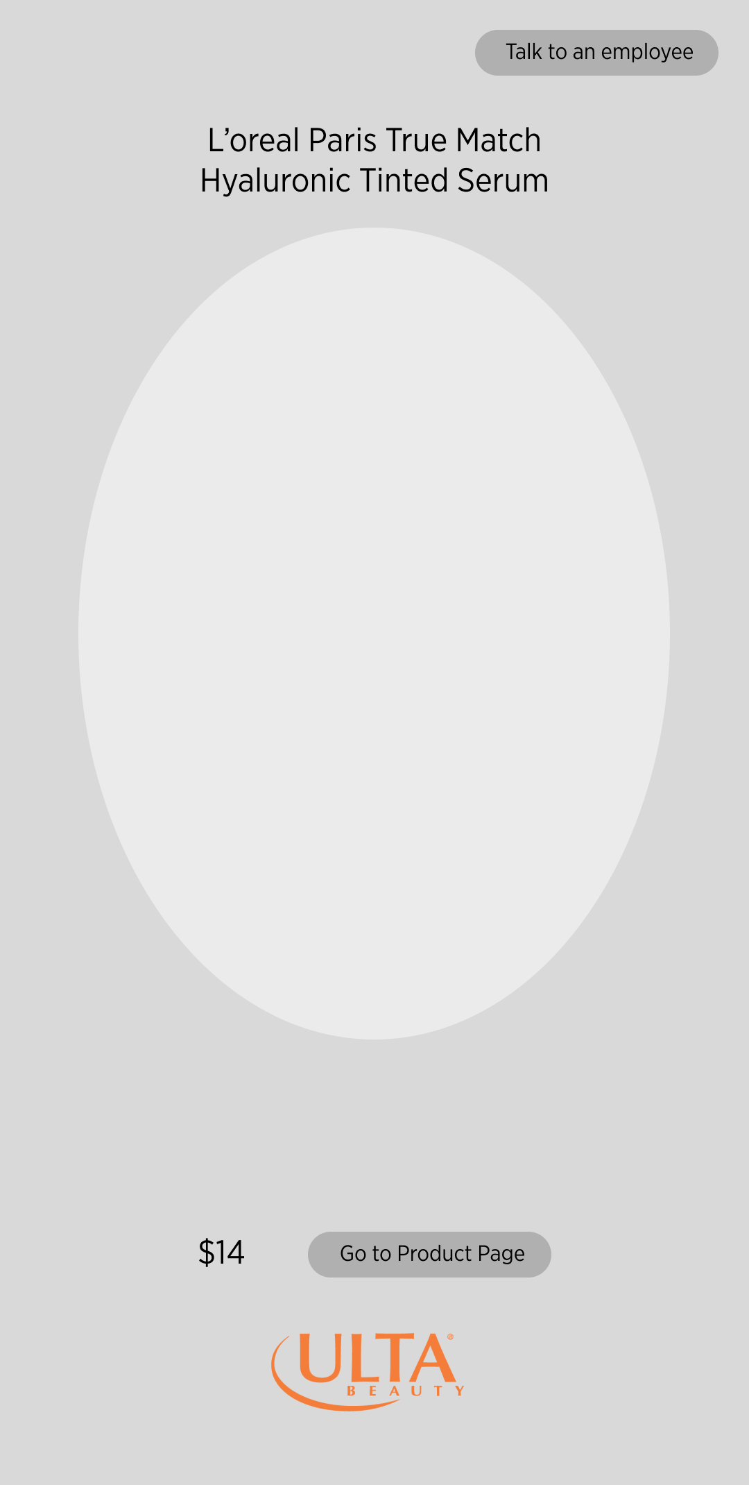
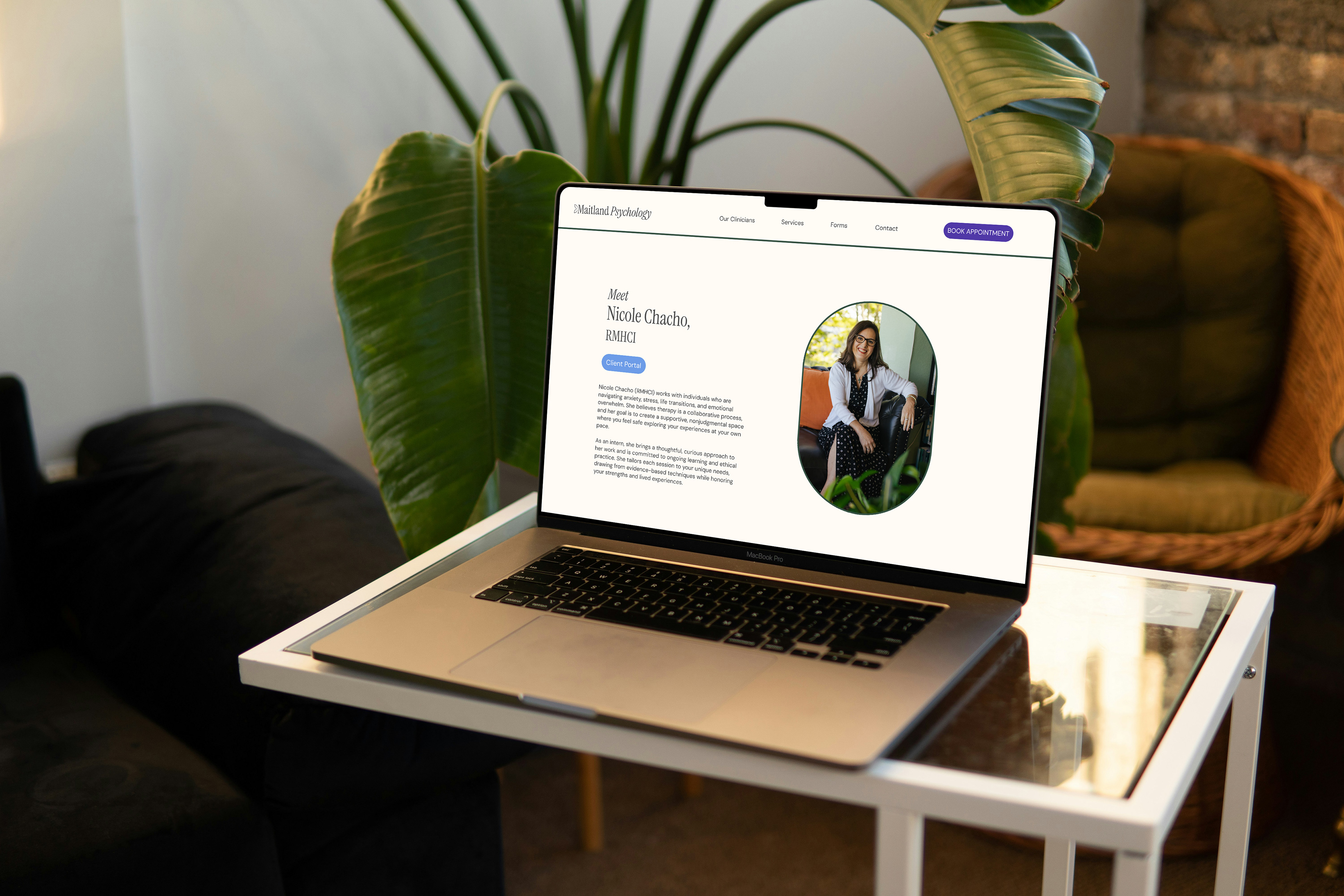
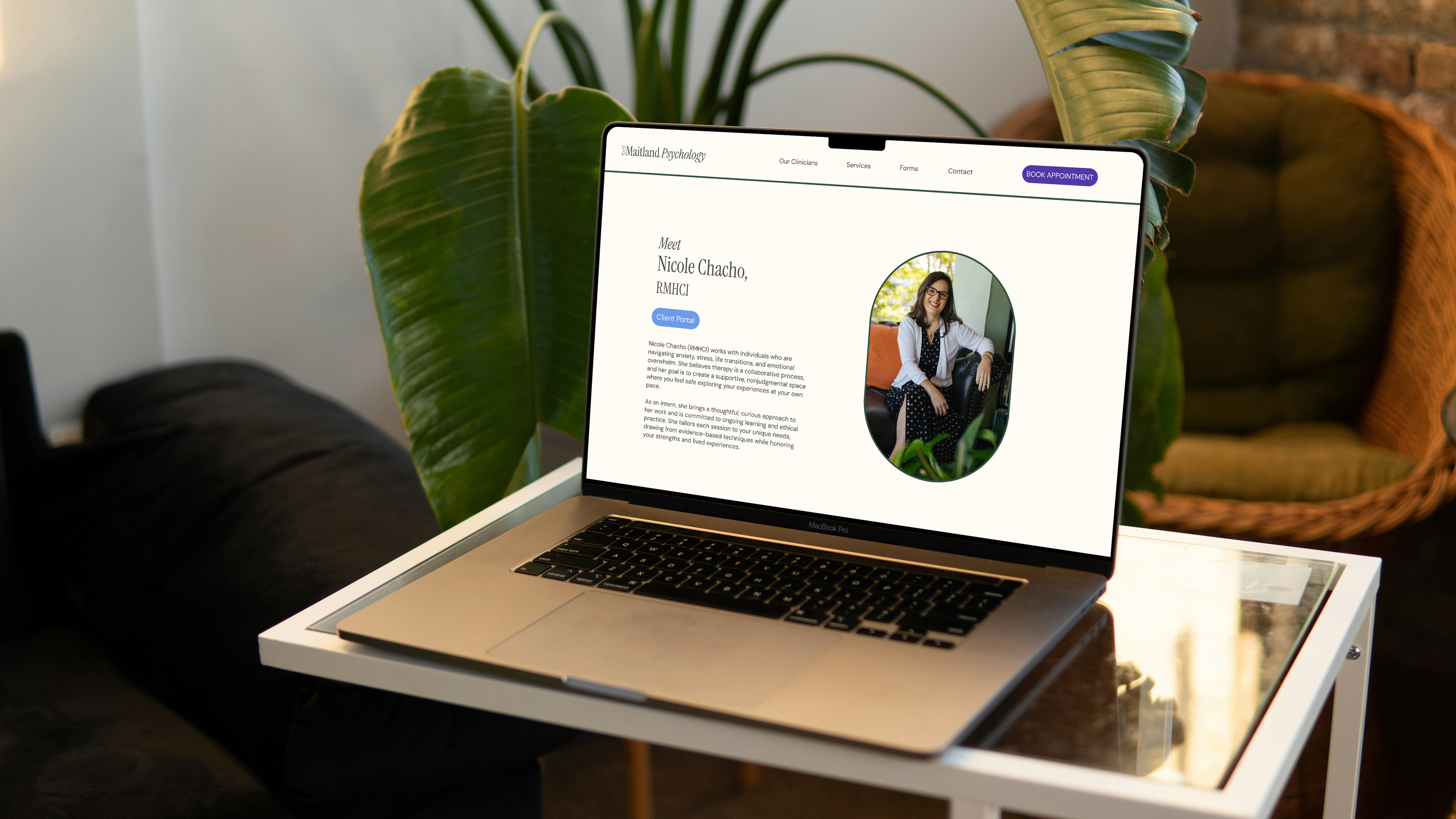
Pages
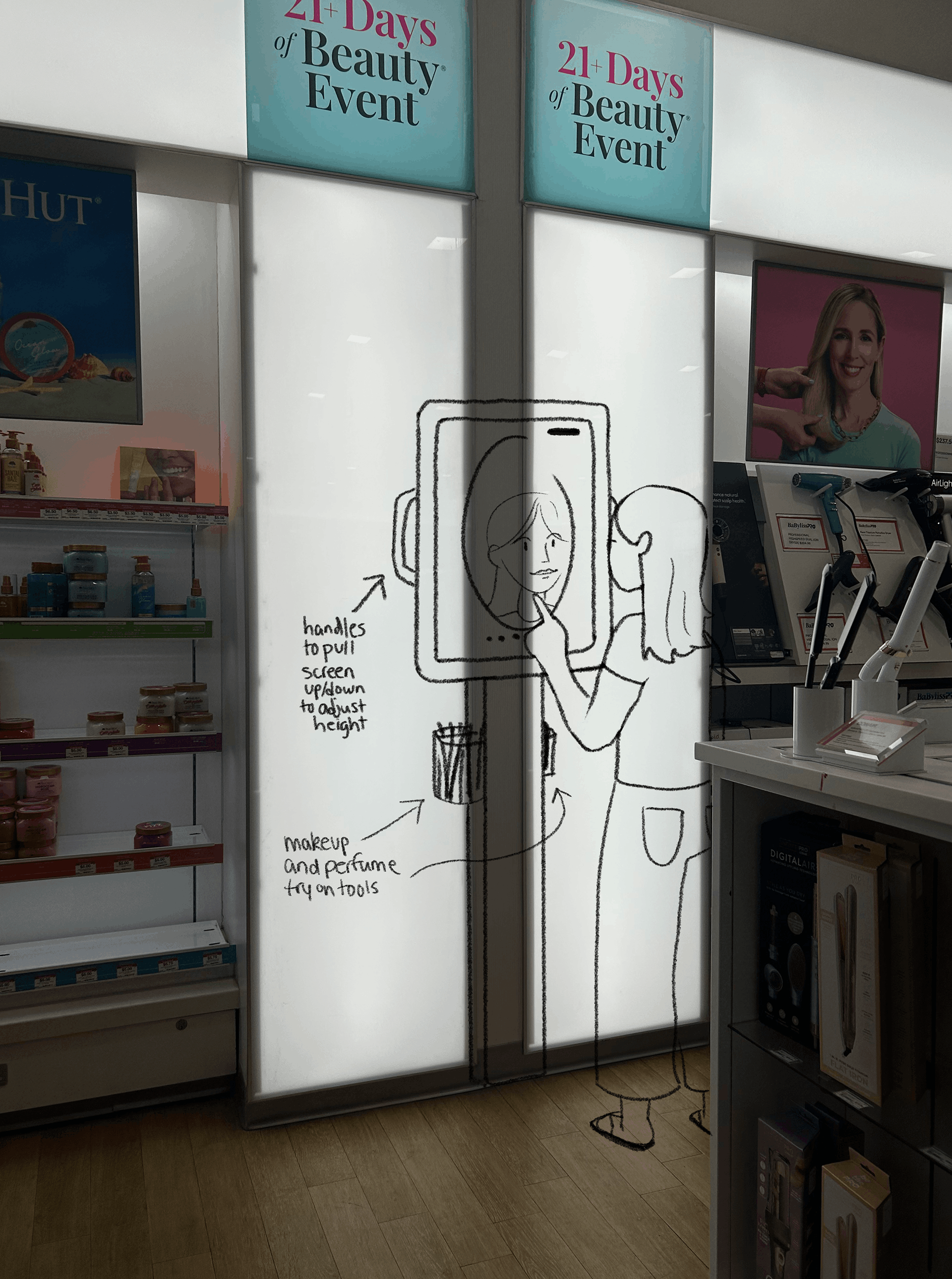
Environmental Design
The kiosk features in-person try on tools in case the user decides to go physically try on the products they are suggested. It also has handles to accomidates the user's height, which can help younger users while still being usable for adult customers.
Type
The typefaces I use for the majority of the text are Montserrat and Gotham Narrow, as they are visually similar to Ulta's official typeface "Circular" which they use for their website. I also used the script "Firula" as it is similar to the scripts Ulta's official website and marketing use, especially for the tagline "the possibilities are beautiful".

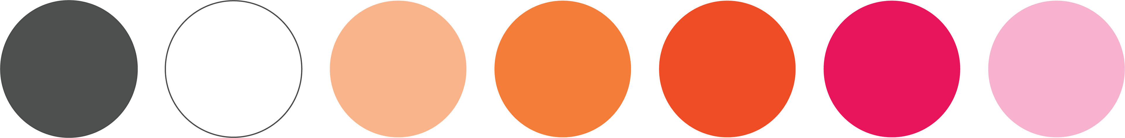
Color
I chose a to use the official bright orange and hot pink in Ulta's logo and website, and adding upon it to create a wider range for contrast and variety for the kiosk. I chose a slightly cooler light pink and two lighter oranges for the backgrounds. I decided on a warm gray with white for the basic text colors as white matched the other colors' values and pure black was too harsh.
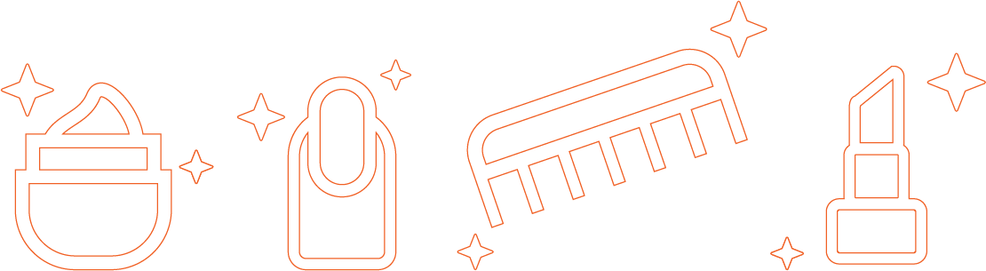
Icons
I chose a to use the official bright orange and hot pink in Ulta's logo and website, and adding upon it to create a wider range for contrast and variety for the kiosk. I chose a slightly cooler light pink and two lighter oranges for the backgrounds. I decided on a warm gray with white for the basic text colors as white matched the other colors' values and pure black was too harsh.