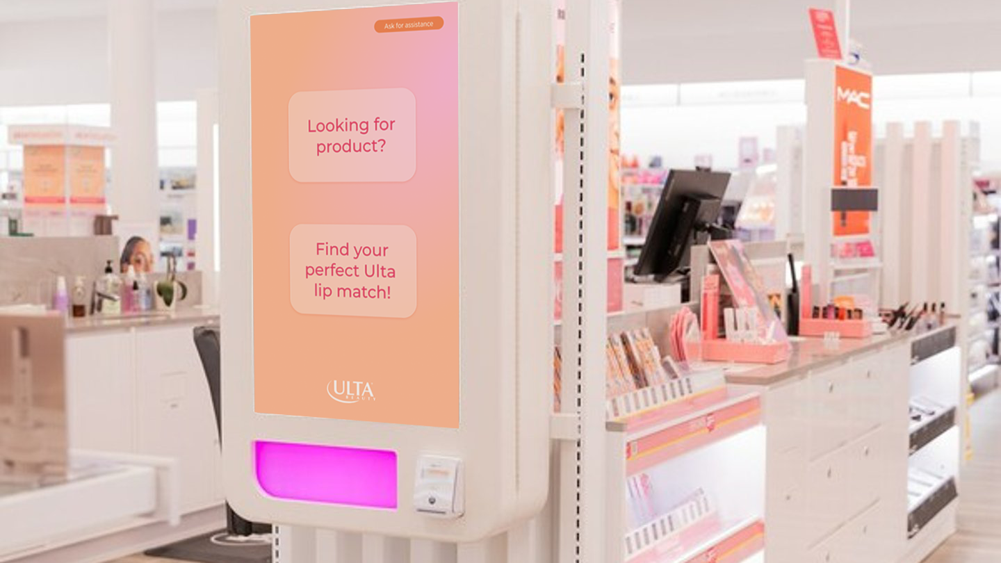
ULTA Beauty Kiosk
Timeline / 4 weeks
Overview
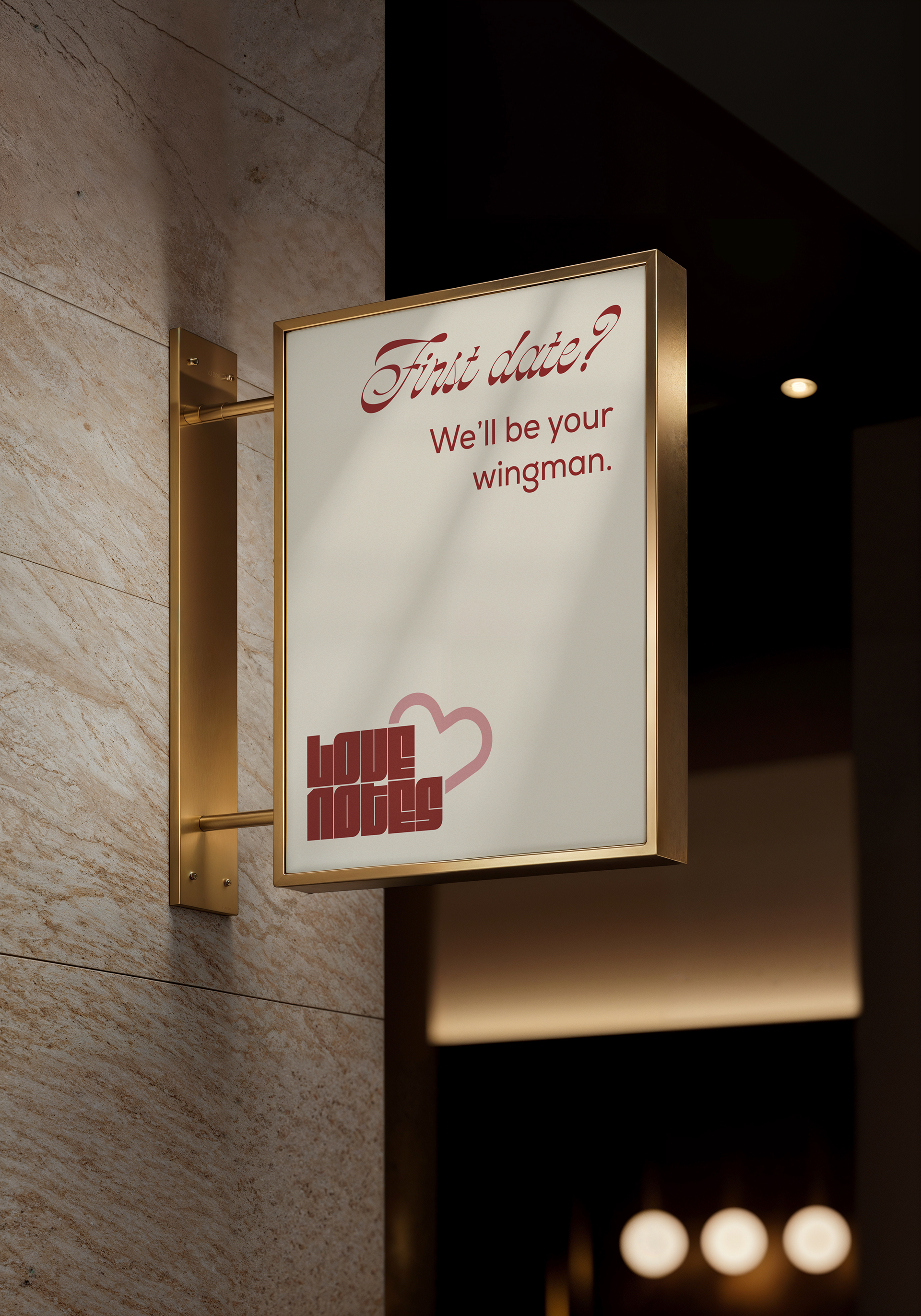
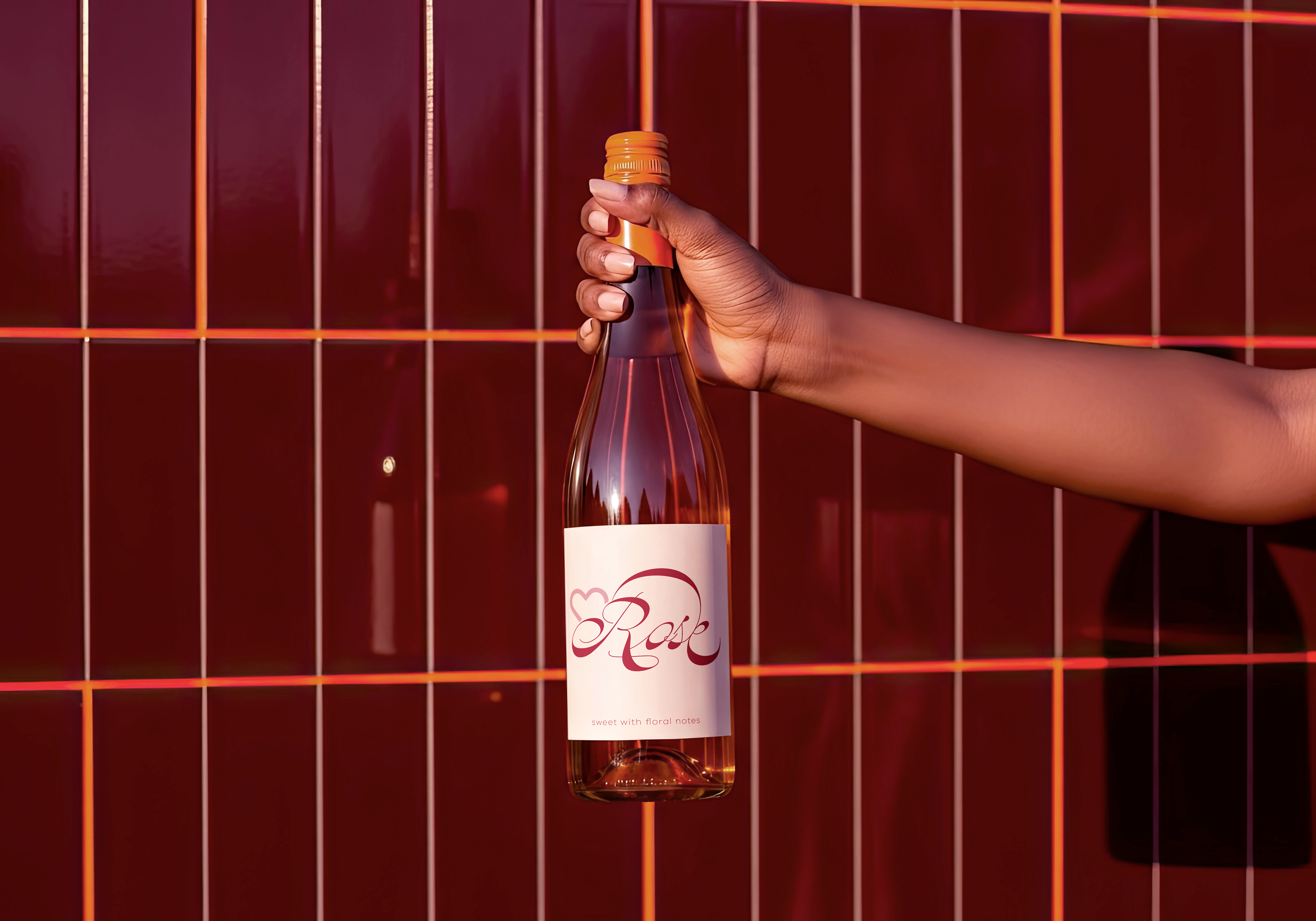
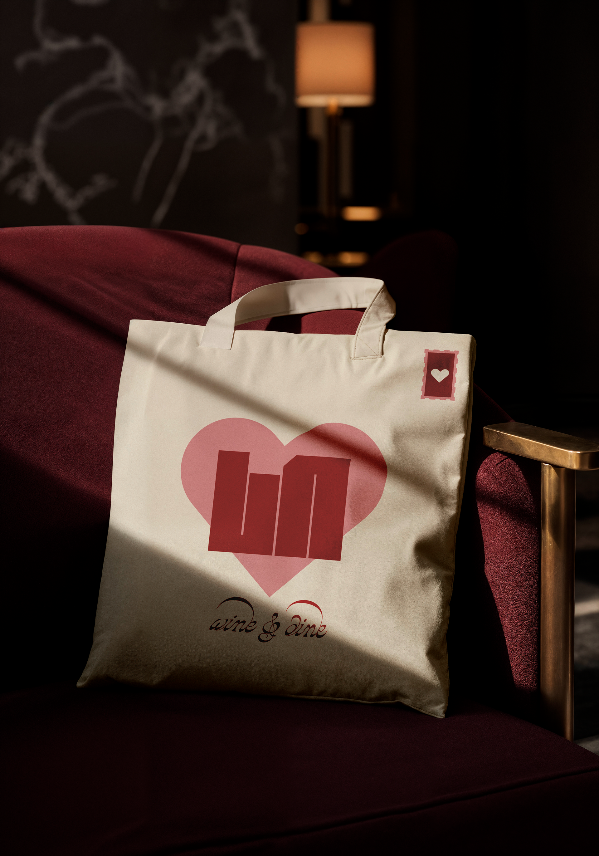
Love Notes is a romance-themed wine and dine designed to turn an evening out into an intimate, sensory experience. Love Notes transforms dining into storytelling, where every course becomes part of a romantic dialogue.
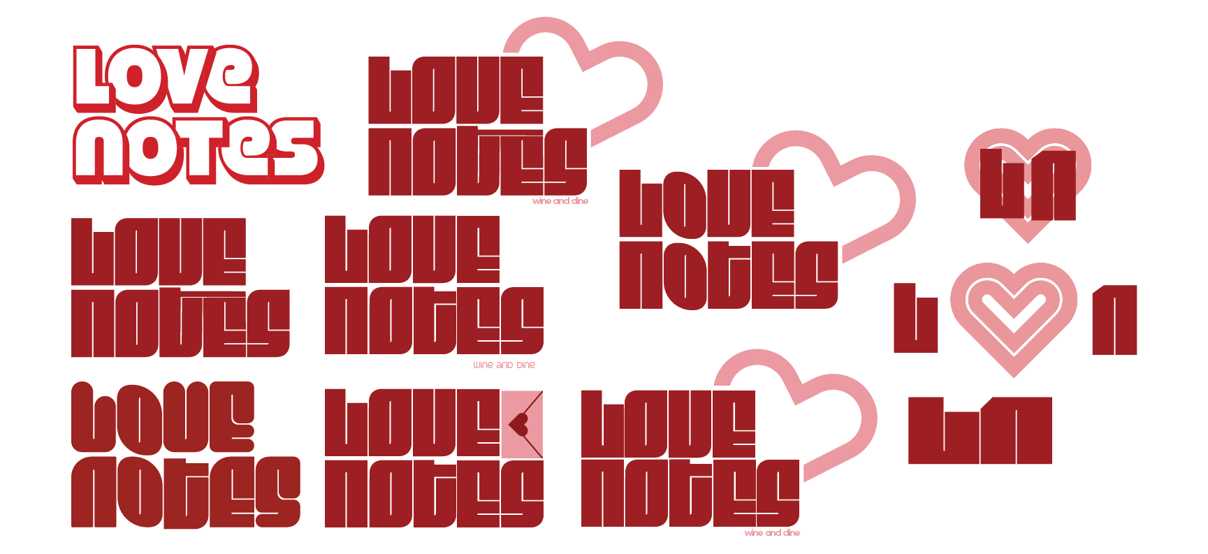
Logo Process
Menu Design
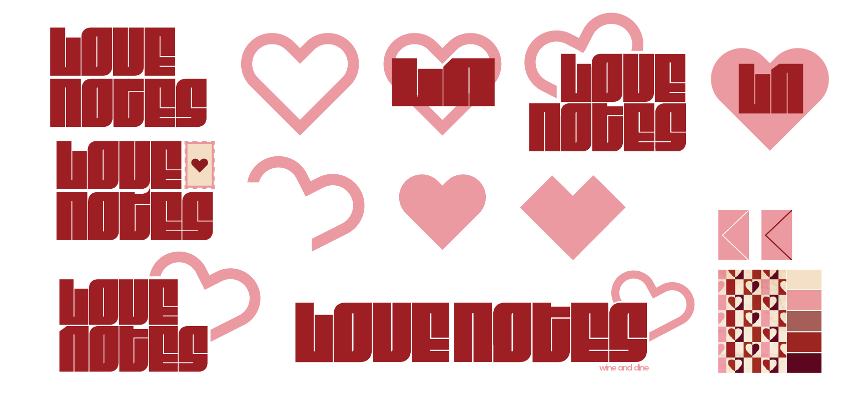
Visual Identity
Target Audience: young adults 18-35

Overview
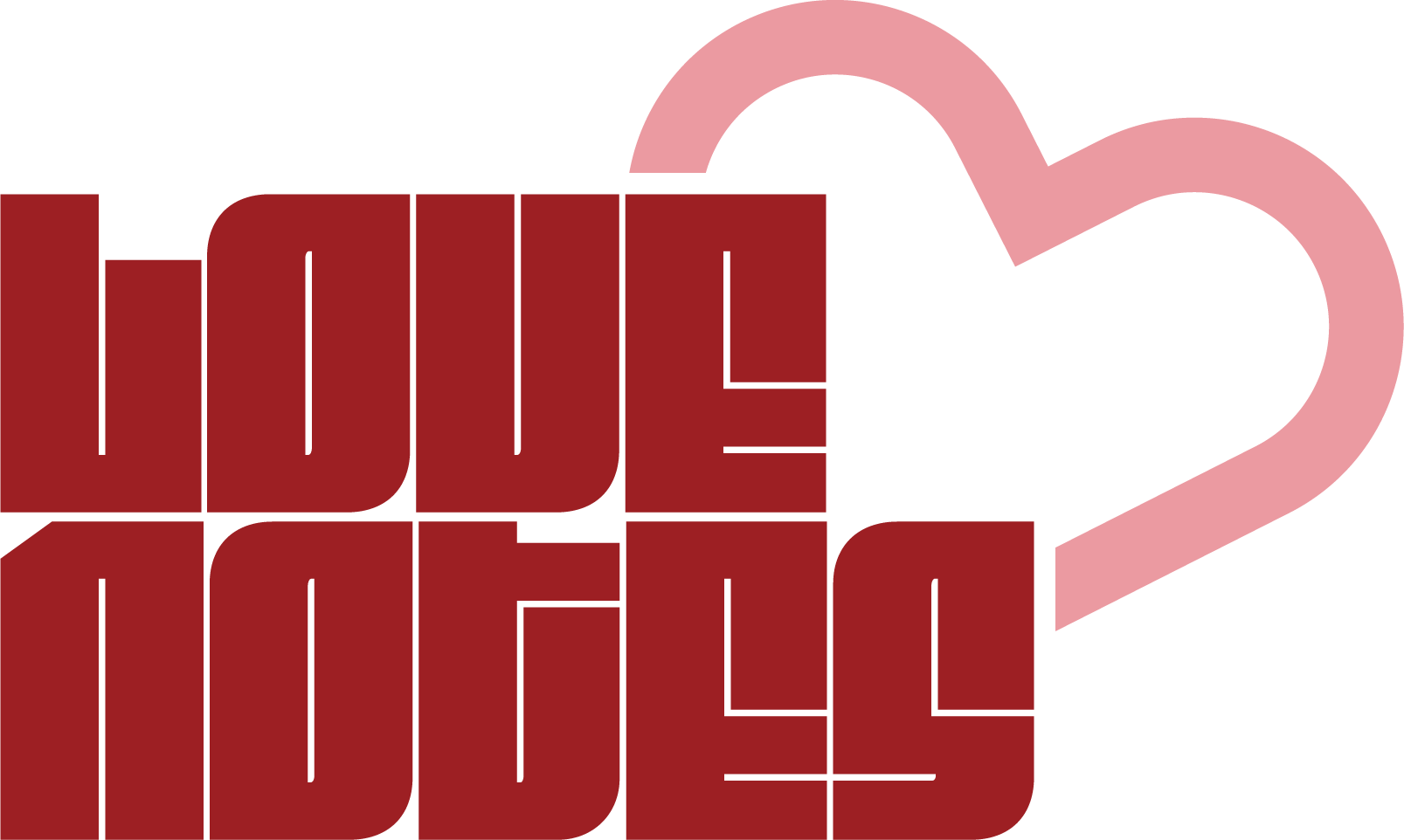
The bold, blocky letters convey confidence and energy. Despite their heaviness, the slightly rounded corners on the "o" letterforms soften the feel, making it approachable rather than aggressive.
The open and closed stylized heart symbolizes love and connection, which is central to a romantic dining experience. Its modern, geometric design keeps the logo fresh and appealing to a youthful demographic. The heart partially overlapping the text gives a sense of interaction and dynamism, suggesting that this is not just a formal dining brand but one that’s fun, lively, and ideal for young couples or friends celebrating together.
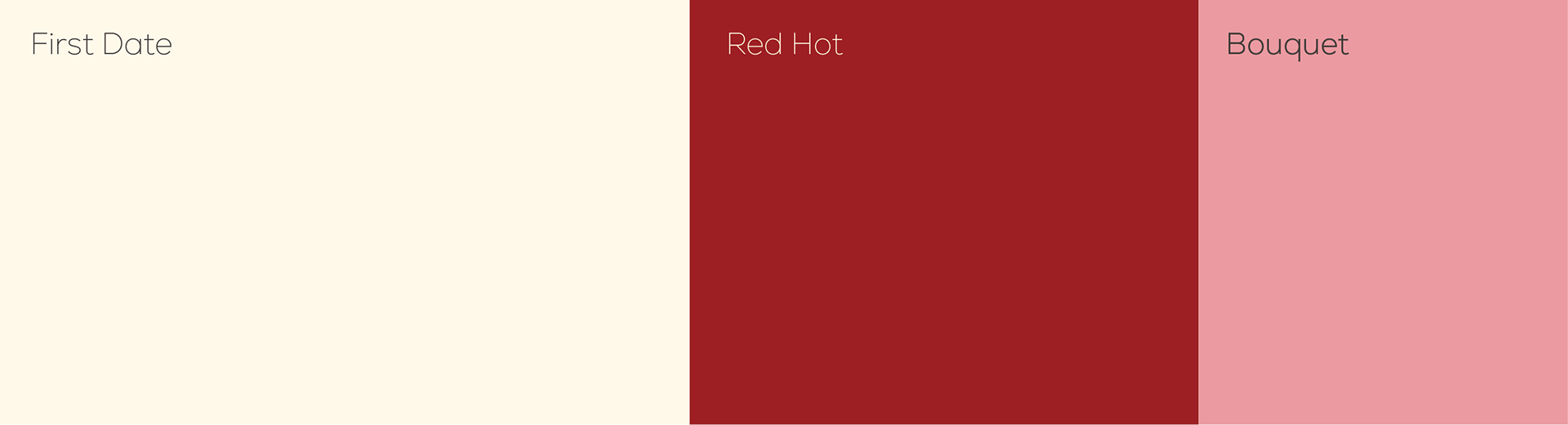
Colors
The main three colors driving the visual identity area soft creamy white, a rich red, and a warm pink. The classic valentines day colors balance out the modern and bold typeface of the logo, contributing to an overall modern take on romance
Type
The typefaces I use for the majority of the text are Montserrat and Gotham Narrow, as they are visually similar to Ulta's official typeface "Circular" which they use for their website. I also used the script "Firula" as it is similar to the scripts Ulta's official website and marketing use, especially for the tagline "the possibilities are beautiful".
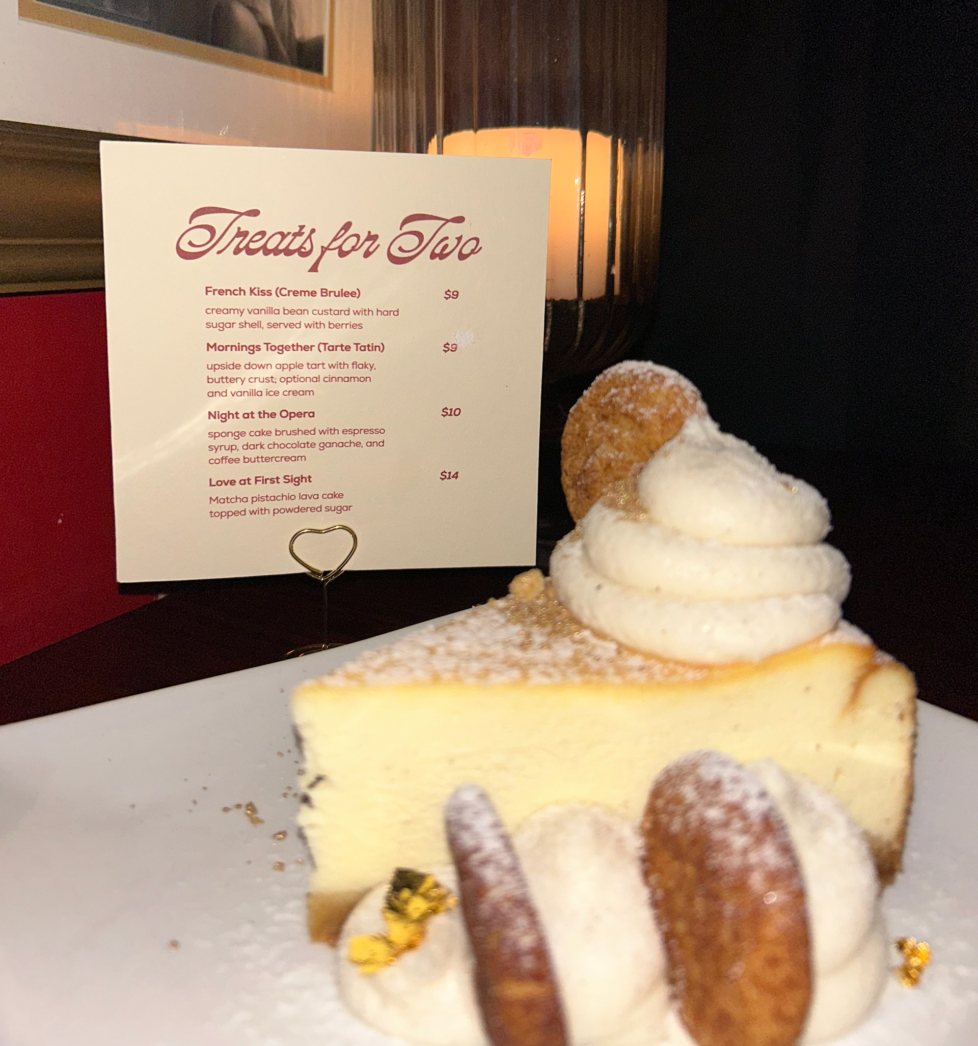
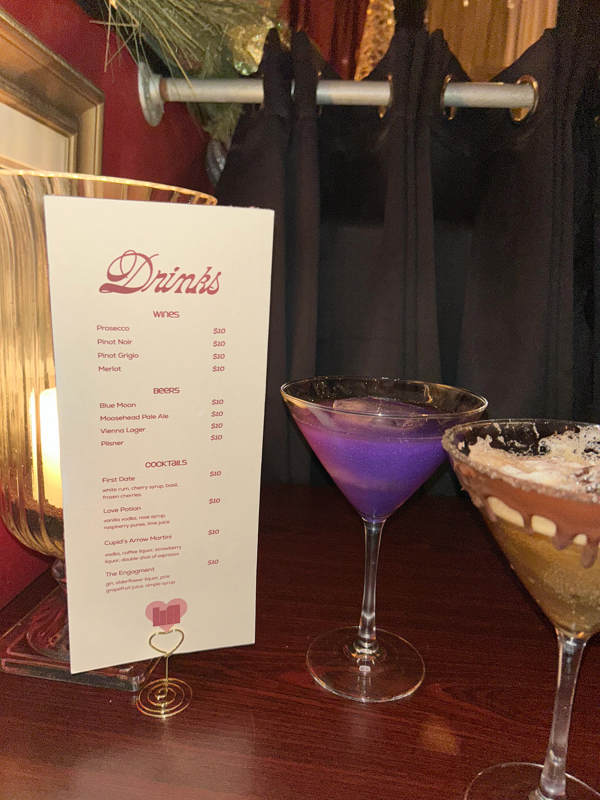
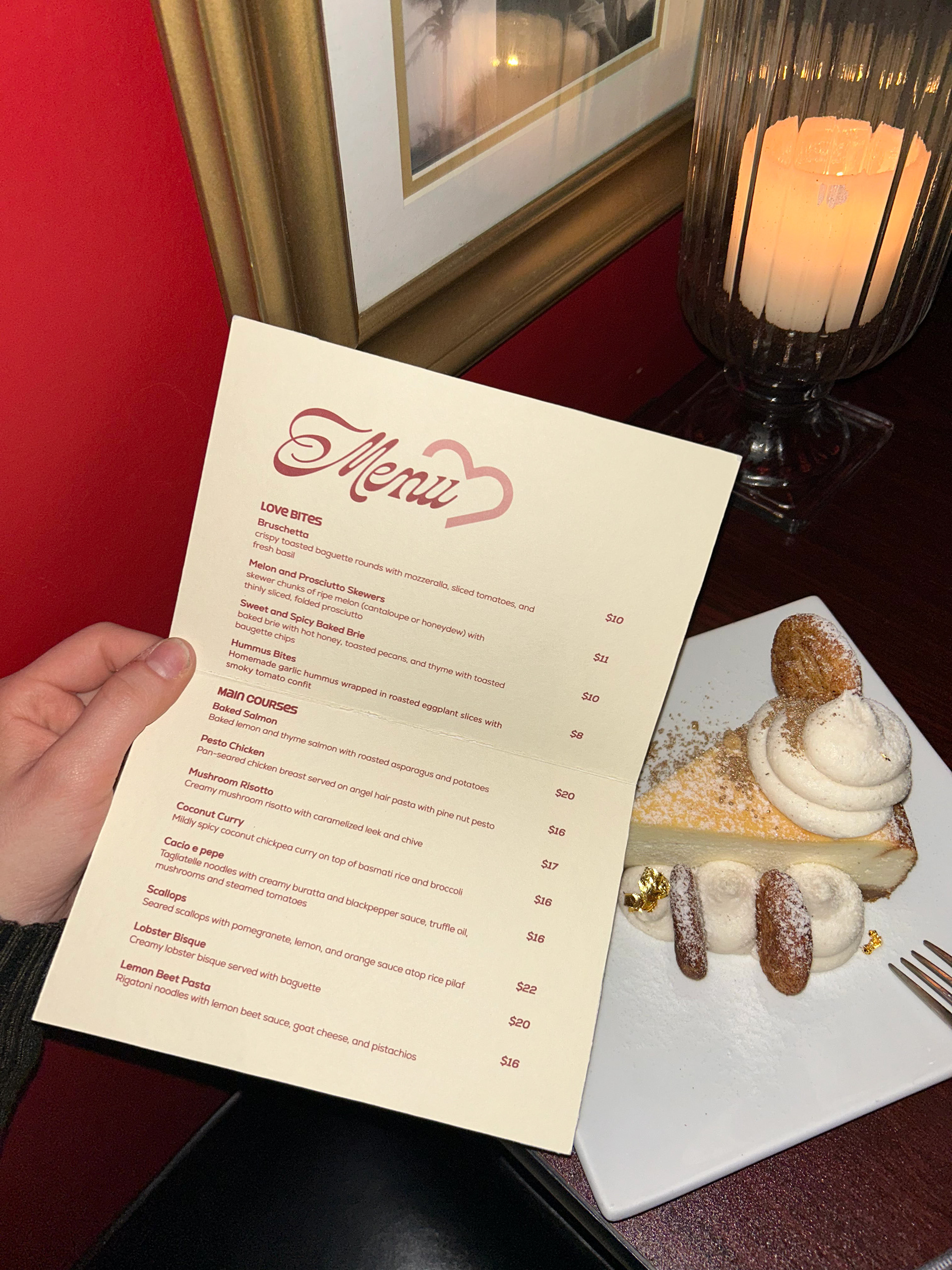
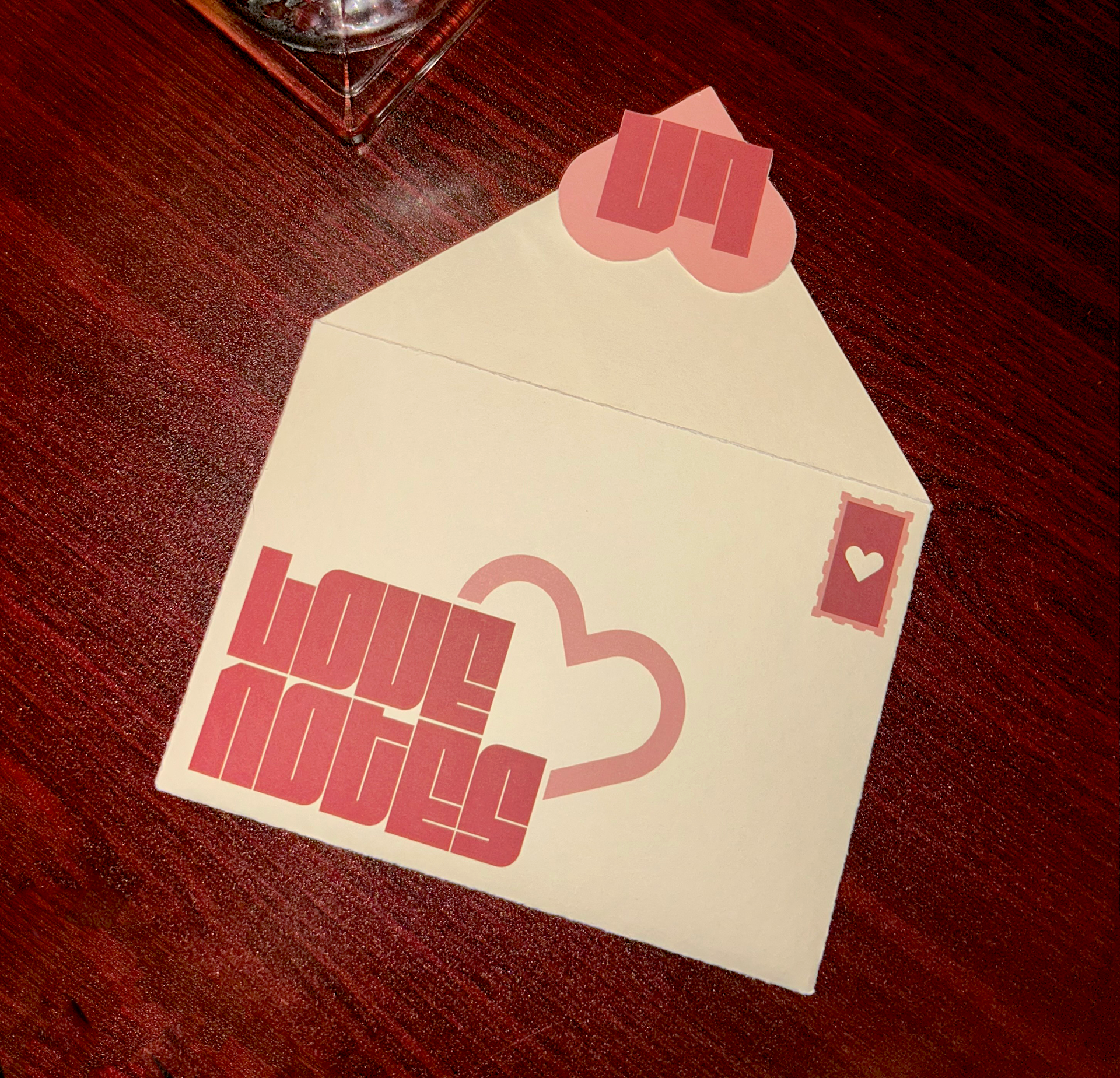
Menu
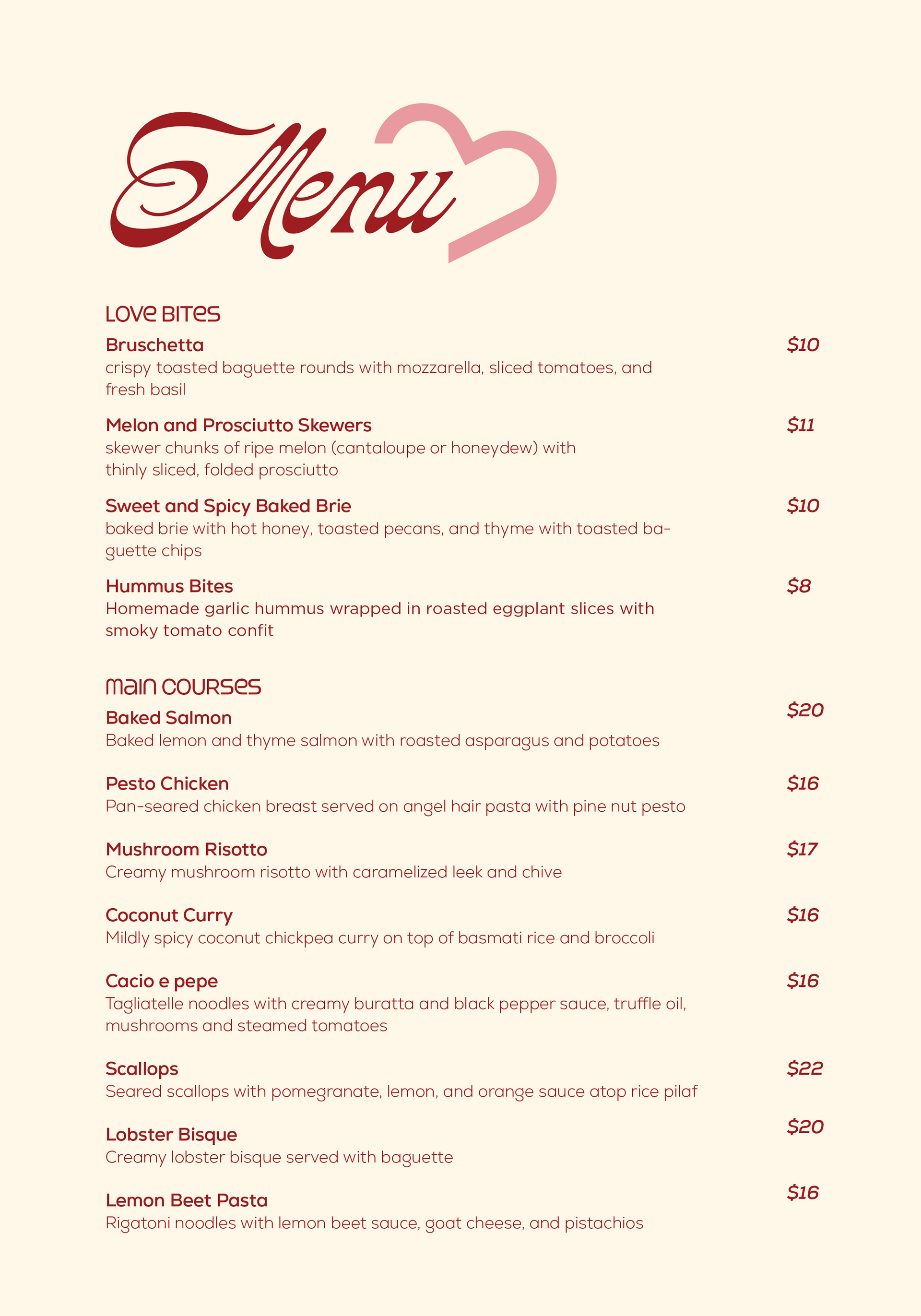
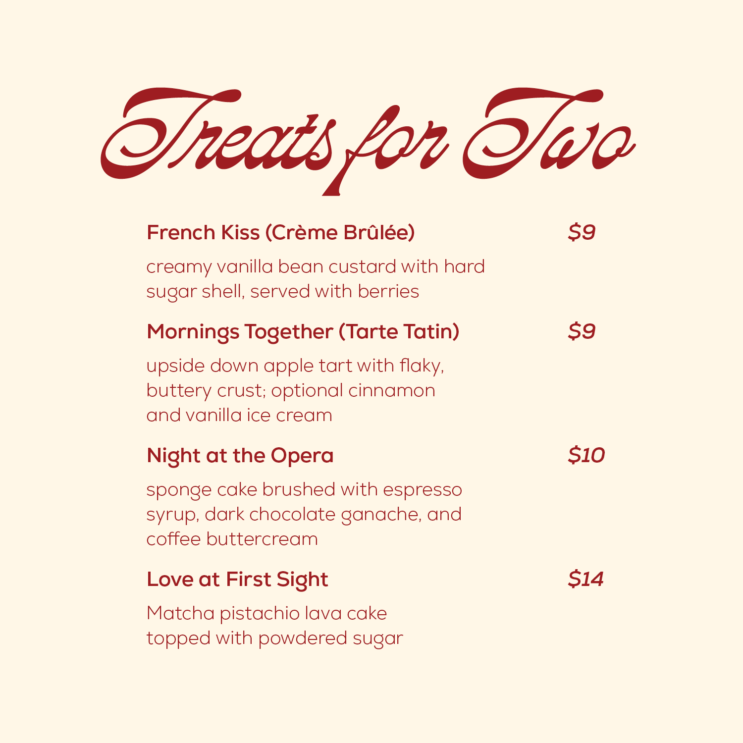
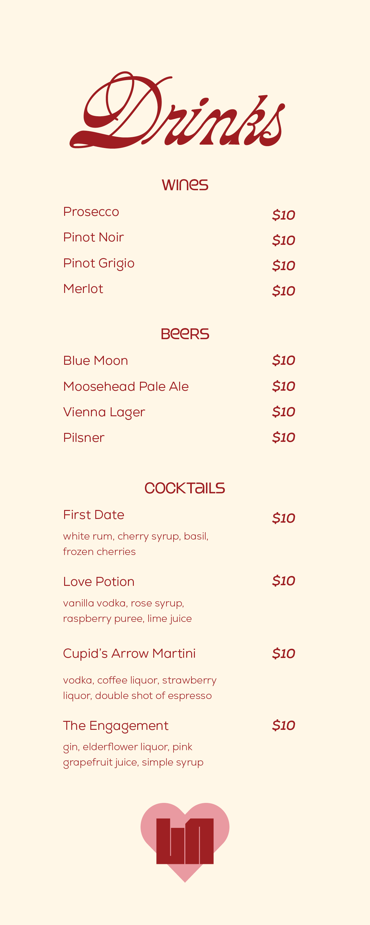
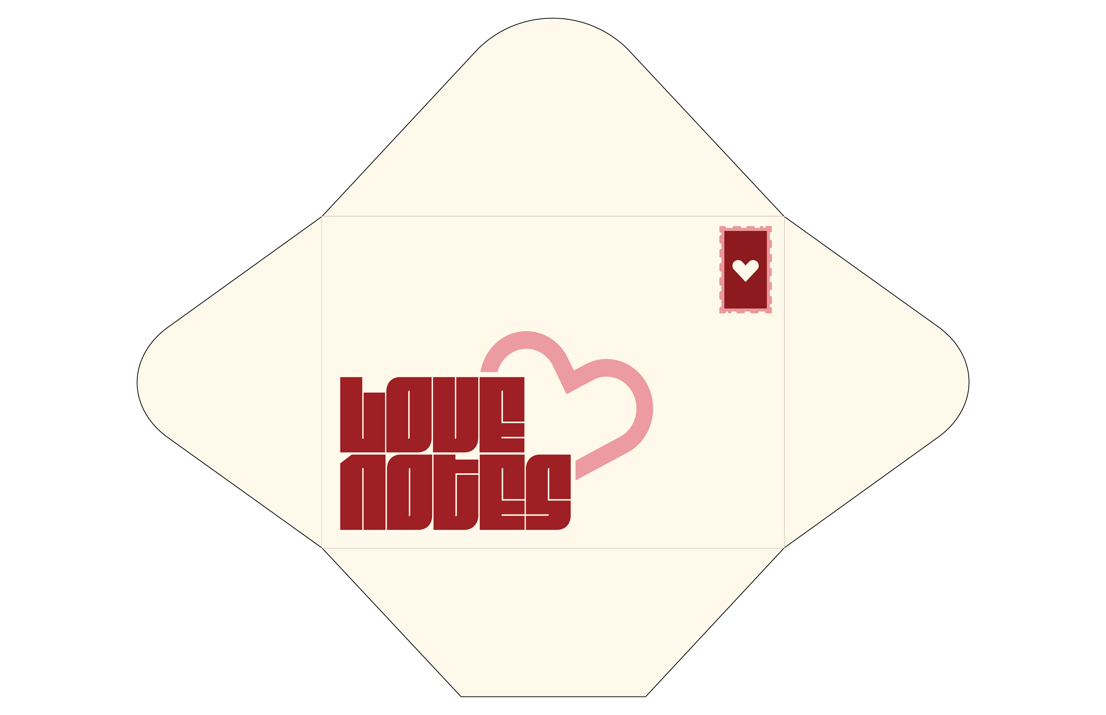
The main courses menu comes in a love-letter inspired envelope that is closed with a sticker of the lovenotes secondary logo. The idea behind this experience is that the resturant is treating each couple special by leaving a love note at the table when they are seated. The drinks menu is provided by a heart shaped stand that matches the logo, and the desserts menu is provided upon request.